
Why Presentation Covers Matter for Diplomas and Certificates

TL;DR:
- Presentation covers shape first impressions by showcasing quality and institutional pride within seconds.
- Choosing the right materials, design, and size enhances protection, appearance, and perception of value.
Presentation covers are the physical and visual gateway that defines how a diploma or certificate is received before anyone reads a single word inside. A well-chosen cover signals preparation, respect for the achievement, and institutional pride. A poor one undermines the document it holds. Understanding why presentation covers matter helps schools, HR departments, and individuals make decisions that protect both the document and the reputation behind it.
Why presentation covers matter for first impressions
Audiences form lasting first impressions within 7 seconds of seeing a presentation cover. That window is shorter than most people expect, and it determines whether the recipient feels honored or underwhelmed before the folder is even opened.
The psychological mechanism here is straightforward. The brain uses visual cues, such as material quality, color consistency, and finish, to make rapid judgments about the person or institution presenting the document. A diploma handed over in a plain paper sleeve reads as an afterthought. The same diploma inside a structured, foil-printed cover reads as a milestone worth commemorating.
Executive decision-makers judge presenter competence within 5 seconds of viewing a cover, and cluttered or generic design signals cluttered thinking. This principle applies directly to certificate presentation. When a hospital hands a physician their board certification in a generic folder, it communicates something about how the institution values that credential. When a university presents a degree inside a custom-branded cover with the school seal foil-stamped on the front, it communicates legacy.
Presentations with strong visual elements see 32% more audience interaction than those without. That statistic comes from slide design research, but the principle transfers directly to physical document presentation. Visual quality drives engagement, and engagement drives the emotional weight of the moment.
Several common mistakes reduce the effectiveness of a cover at this critical stage:
- Using a cover that does not match the document’s dimensions, leaving visible gaps or awkward folds
- Choosing generic, unbranded designs for institutional presentations where brand identity matters
- Selecting materials that feel flimsy or cheap, which contradicts the value of the document inside
- Overcrowding the cover with text or imagery, which signals a lack of confidence in the design
- Ignoring color consistency with the organization’s existing visual identity
Pro Tip: Match the cover’s color palette to your institution’s official brand colors. Even a single foil color applied consistently across all covers creates a cohesive, professional impression that generic designs cannot replicate.
What materials and protective features make covers effective?
A presentation cover’s job is not only visual. It protects the document from spills, dirt, bending, and the general wear that comes with handling. The material and construction determine how well it does that job over time.
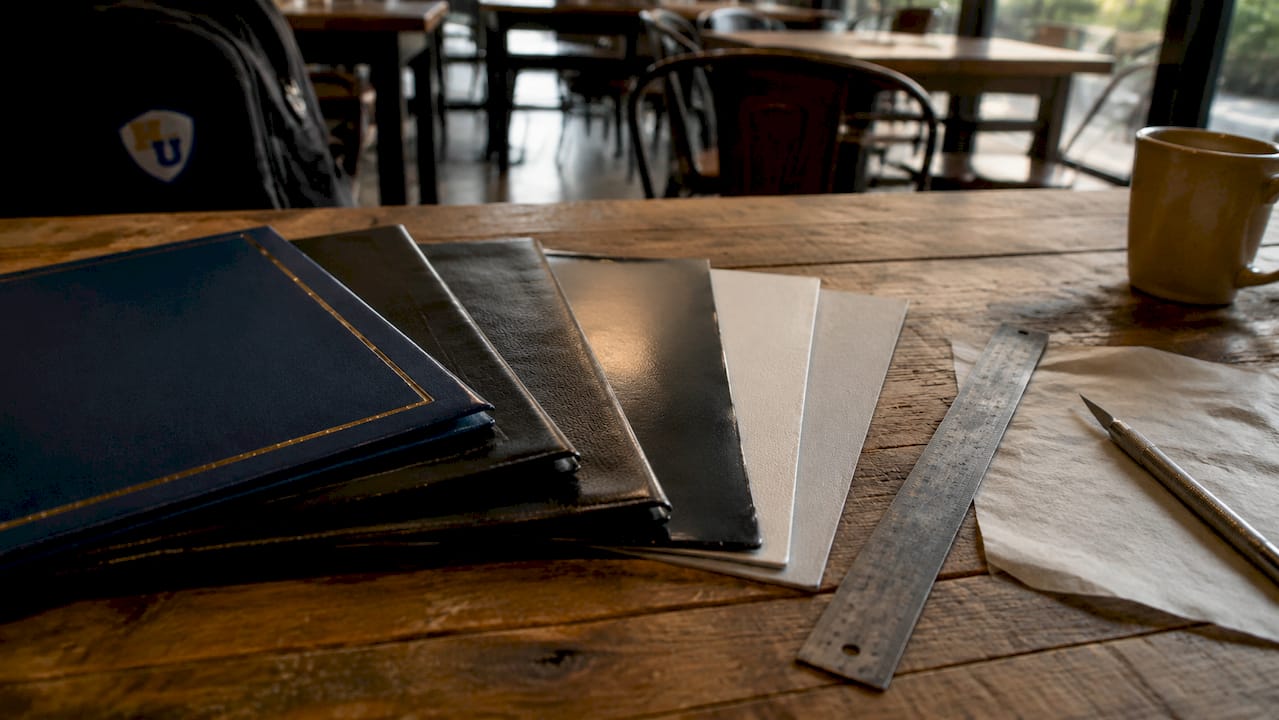
Material thickness is measured in mils, where one mil equals one-thousandth of an inch. Standard covers typically fall in the 8mil to 12mil range, which provides reliable protection against everyday handling. Covers at 20mil or above are considered heavy-duty and are suited for documents intended for long-term display or archival storage. A diploma that will be framed and displayed for decades warrants a heavier cover than a training certificate that will be filed in a drawer.
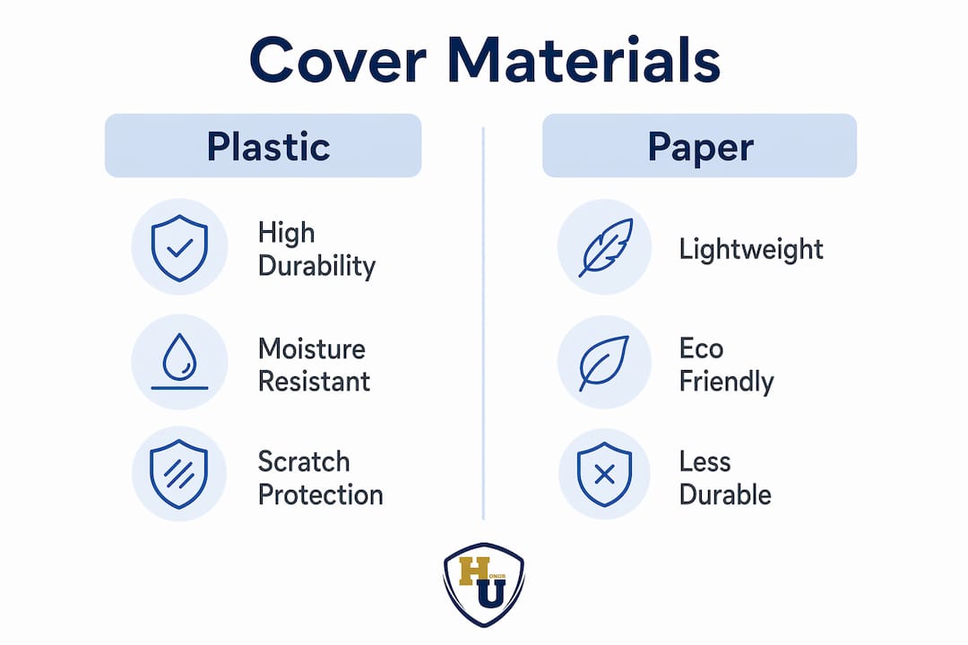
The choice between plastic and paper covers also matters. Plastic covers, particularly those made from polypropylene or PVC, resist moisture and are less likely to tear under pressure. Paper covers offer a warmer, more traditional aesthetic that suits formal academic and religious documents. Neither is universally superior. The right choice depends on the occasion, the document’s expected lifespan, and the visual tone the presenter wants to set.
| Feature | Standard (8–12mil) | Heavy-Duty (20mil+) |
|---|---|---|
| Moisture resistance | Moderate | High |
| Scratch resistance | Moderate | High |
| Best use case | Training certificates, awards | Diplomas, long-term display |
| Corner style options | Rounded or square | Square preferred |
| Typical material | Polypropylene | PVC or reinforced poly |
Square corners on presentation covers deliver a crisper, more formal appearance preferred for high-stakes documents like diplomas and professional certifications. Rounded corners read as softer and are better suited to informal recognition materials. For institutions presenting formal credentials, square corners are the standard choice.
Scratch protection is a detail that separates quality covers from budget options. Clear covers often include tissue buffer sheets to prevent scuffing during shipping and storage. Removing these tissue protectors too early causes surface marks that are visible under light and reduce the cover’s professional appearance immediately.
Pro Tip: Store finished covers flat with tissue sheets in place until the moment of presentation. Even a single transit scratch on a clear cover is visible to the recipient and diminishes the quality signal you worked to create.
How to design presentation covers that enhance appeal
Design is where the functional and the ceremonial meet. A well-designed cover does three things at once: it identifies the issuing organization, it frames the document’s importance, and it creates a visual memory anchor for the recipient. Audiences retain 65% of information presented visually versus 10% from text-heavy formats. A strong visual design on a diploma cover becomes part of the recipient’s memory of the moment.
The following design principles apply directly to diploma and certificate covers:
-
Establish a clear visual hierarchy. The organization’s name or seal should be the dominant element. The document type, such as “Diploma of Graduation” or “Certificate of Completion,” comes second. Supporting details, like year or program name, come third. Reversing this order creates visual confusion and dilutes the cover’s authority.
-
Limit the color palette. Two to three colors maximum. Institutional covers that use more than three colors tend to look busy rather than prestigious. Metallic foil in gold, silver, or bronze adds a formal quality that flat ink cannot replicate, and it reads as premium even at a distance.
-
Choose typography that matches the occasion. Serif typefaces, such as those in the Garamond or Times New Roman family, carry academic and formal associations built over centuries of use in institutional documents. Sans-serif fonts work for modern corporate certificates but can feel out of place on a traditional university diploma.
-
Place the logo or seal at the visual anchor point. For tent-style covers, the front panel is the primary display surface. The logo or seal belongs centered on that panel, with enough white space around it to breathe. Crowding the seal with text reduces its authority.
-
Match the cover’s physical format to the document’s purpose. Tent-style covers stand upright and display the document without a frame, which suits graduation ceremonies and award presentations where the recipient will show the cover to others. Flat folder-style covers suit documents that will be stored or mailed.
-
Test the design at actual size before ordering in bulk. A design that looks balanced on a screen can feel crowded or sparse when printed on a physical cover. Wehonoru’s custom cover design options allow institutions to review specifications before committing to a full order.
Professional covers function as gateways that set audience expectations before the content inside is ever seen. This is why treating cover design as a secondary concern is a mistake. The cover is the first communication the recipient receives from the issuing organization, and it carries the full weight of that institution’s reputation.
Practical considerations for selecting and using presentation covers
Selecting the right cover requires matching several variables: the document’s physical dimensions, the occasion’s formality level, the organization’s branding requirements, and the cover’s expected lifespan. Getting any one of these wrong produces a result that looks mismatched, even if the individual elements are high quality.
Key practical factors to evaluate before purchasing:
- Document size compatibility. Standard diploma sizes vary by institution. An 8.5 x 11 inch diploma requires a different cover than an 11 x 14 inch one. Covers that are too large allow the document to shift and crease. Covers that are too small force the document to bend. Wehonoru offers made-to-fit custom sizing for non-standard dimensions, which is particularly useful for military commendations, trade school certificates, and international credentials that do not conform to U.S. standard sizes.
- Occasion formality. A high school graduation ceremony calls for a more formal cover than an internal employee recognition award. Metallic foil printing and structured materials suit formal occasions. Lighter paper covers with simple designs suit informal recognition programs.
- Order quantity and lead time. Institutions ordering for a graduation class need to account for production and shipping time. Wehonoru’s one-business-day production turnaround addresses last-minute needs that standard suppliers cannot accommodate.
- Maintenance and handling. Covers should be stored flat, away from direct sunlight, which can fade foil finishes over time. Plastic covers can be wiped clean with a dry cloth. Paper covers should not be stored in humid environments.
The cost-versus-value calculation for presentation covers is straightforward. A cover that costs a few dollars per unit adds measurable perceived value to a document that represents years of effort. The role of document presentation in professional communication is well established. Institutions that invest in quality covers signal that they take their graduates’ and employees’ achievements seriously.
Pro Tip: Order a small sample batch before committing to bulk quantities. Verify that the cover’s dimensions, material weight, and foil finish match your expectations in person before the ceremony date.
Key Takeaways
Presentation covers are professional communication tools that shape perception, protect documents, and honor the significance of the achievement they contain.
| Point | Details |
|---|---|
| First impressions form fast | Audiences judge cover quality within 7 seconds, making visual design a critical investment. |
| Material thickness determines protection | Choose 8–12mil for standard use and 20mil or above for long-term display or archival needs. |
| Design hierarchy drives authority | Place the organization’s seal or logo as the dominant element, with limited color and formal typography. |
| Custom sizing prevents damage | Covers that match the document’s exact dimensions prevent creasing, shifting, and a mismatched appearance. |
| Covers signal institutional values | A quality cover communicates that the issuing organization respects the achievement it is recognizing. |
What I’ve learned from watching covers get it wrong
I’ve seen the same mistake repeated across graduation ceremonies, corporate award events, and healthcare credentialing programs. The document itself is carefully prepared. The ceremony is planned in detail. And then the cover is treated as an afterthought, ordered from a generic supplier at the last minute, in a standard size that does not quite fit.
The recipient notices. They may not articulate it, but the slight looseness of the document inside the cover, the flat unbranded surface, the flimsy material that bends when held, all of it registers. The cover is the physical handshake that accompanies the moment. A weak handshake at the wrong moment leaves an impression that the content inside cannot fully correct.
What I find most underappreciated is the cumulative effect on institutional reputation. A university that consistently presents degrees in well-made, branded covers builds an association between its name and quality. A company that hands out employee-of-the-year awards in premium foil-printed folders reinforces that its recognition programs are genuine. These are not large investments. They are precise ones.
The other misconception worth addressing is that custom covers are only for large institutions with big budgets. Wehonoru’s no-minimum ordering model means a small homeschool co-op presenting diplomas to five graduates can order five covers with the same custom foil branding that a university uses for five thousand. The certificate display practices that work for large institutions scale down without losing their effect.
Treat the cover as part of the credential, not the packaging around it. That shift in thinking produces better decisions at every stage, from design to material selection to the moment of presentation.
— Manager
Quality presentation covers for diplomas and certificates at Wehonoru
Wehonoru specializes in custom diploma covers and certificate holders built for the standards described throughout this article. Products include the classic diploma graduation cover, a tent-style document cover with metallic foil printing available in multiple colors, designed to stand upright and display the credential with the formality it deserves.
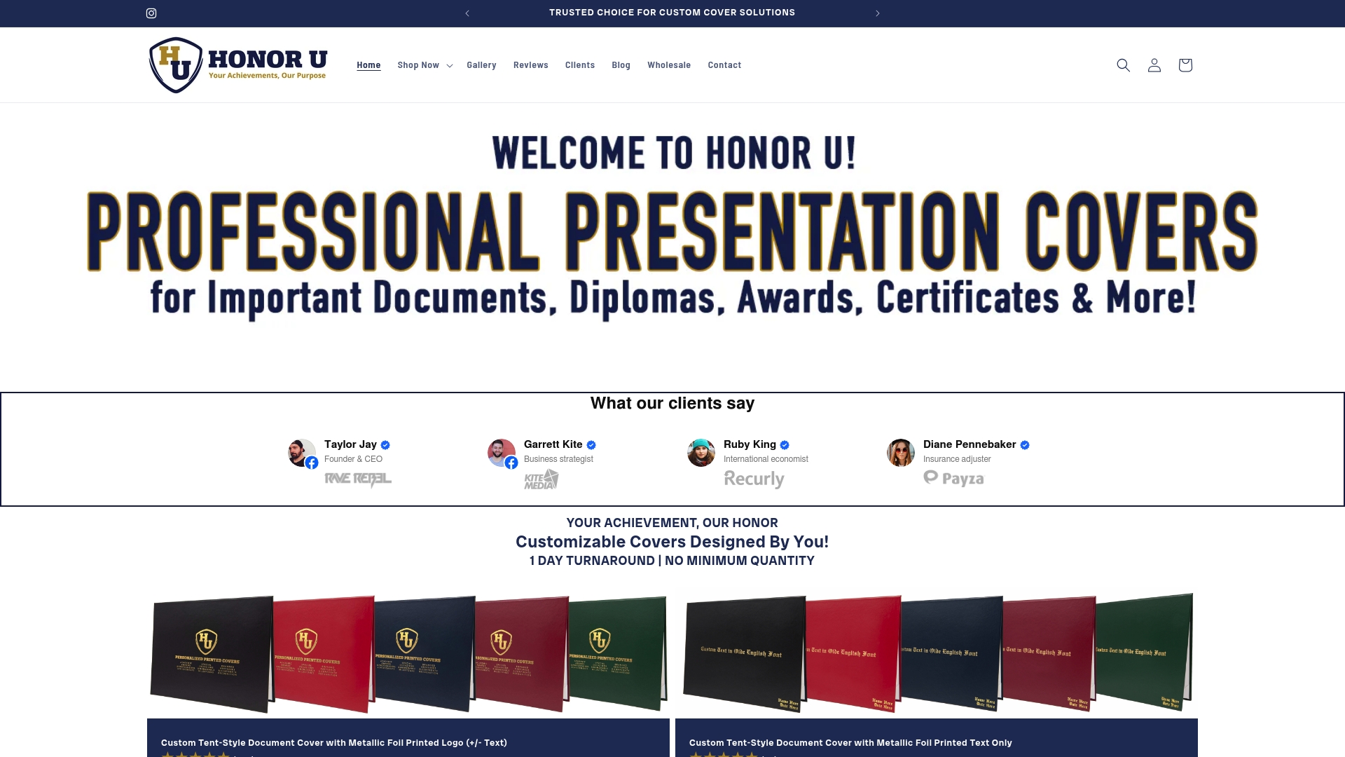
For graduation classes and cohort-based programs, the Class of graduation cover offers a year-specific design that marks the occasion precisely. Orders ship in one business day with no minimum quantity required, and free shipping applies to orders over $30. Custom sizing is available for non-standard document dimensions, with no setup fees.
FAQ
Why do presentation covers matter for diplomas?
Presentation covers protect the physical document and create the first visual impression of the issuing institution. Audiences form judgments within 7 seconds of seeing a cover, making design and material quality a direct reflection of institutional standards.
What thickness should a diploma cover be?
Standard diploma covers range from 8mil to 12mil for everyday use. Documents intended for long-term display or archival storage benefit from 20mil or heavier covers, which provide greater resistance to moisture, bending, and surface scratching.
Do square corners make a difference on a presentation cover?
Square corners deliver a crisper, more formal appearance than rounded corners and are the preferred choice for high-stakes documents like diplomas and professional certifications. Rounded corners suit informal recognition materials where a softer aesthetic is appropriate.
How do I prevent scratches on clear presentation covers?
Keep the tissue buffer sheets in place during storage and transit, and remove them only at the moment of presentation. Removing tissue protectors early exposes the cover surface to scuffing, which is visible under light and reduces the professional appearance of the finished product.
Can small organizations order custom-branded covers without bulk minimums?
Wehonoru accepts orders for a single unit with no setup fees, making custom foil-printed covers accessible to small schools, nonprofits, and individual presenters. This removes the budget barrier that traditionally limited custom branding to large institutional buyers.