The Role of Document Presentation in Professional Communication

TL;DR:
- Effective document presentation, including design, structure, and physical quality, enhances clarity and perceived value. Proper typography, semantic accessibility, and strategic layout ensure better comprehension and assistive technology compatibility. Treating presentation as a deliberate communication strategy increases engagement, credibility, and understanding across organizational documents.
Document presentation is defined as the deliberate design, structuring, and formatting of documents to maximize clarity, comprehension, and perceived value for a specific audience. Most professionals treat presentation as an afterthought, a cosmetic layer applied after the real work is done. That instinct is wrong, and the research proves it. The role of document presentation extends far beyond aesthetics: it determines whether your audience reads, understands, and acts on what you have written. For organizations managing diplomas, certificates, training records, and formal recognition documents, presentation quality directly shapes how recipients and observers perceive the significance of those achievements.
What is the role of document presentation in professional settings?
Document presentation is the primary mechanism through which written content becomes effective communication. A document that contains accurate information but lacks deliberate structure, legible typography, and logical navigation will consistently underperform compared to one that applies evidence-based design principles. The industry term for this discipline is document design, and it encompasses typography, layout, reading order, accessibility compliance, and visual hierarchy working together as a unified system.
The purpose of document presentation goes well beyond making pages look polished. Presentation scaffolding determines how readers navigate content, where their attention lands first, and how much cognitive effort they must spend to extract meaning. When that scaffolding is absent or poorly constructed, readers fill in gaps with their own assumptions, which produces varied understandings of the same source material. For high-stakes documents such as legal certifications, medical credentials, or graduation diplomas, that variance carries real consequences.
Three named entities define the current state of the field: Adobe Acrobat’s Generate presentation tool, which converts documents into structured presentations automatically; the Purdue OWL style guides, which govern academic document formatting standards; and the Web Content Accessibility Guidelines (WCAG), which set the accessibility benchmarks that professional documents must meet. Understanding how these frameworks interact gives organizations a practical foundation for improving every document they produce.
How typography, layout, and accessibility shape readability
Typography is a human-factors design variable, not a stylistic preference. Research measuring reading speed and comprehension across font types and sizes found that Helvetica at 11 pt produced the fastest reading times among tested typefaces, and that larger font sizes consistently improved comprehension scores. This finding matters because most corporate and institutional documents default to 10 pt body text to fit more content per page, a trade-off that measurably reduces how much readers retain.

Visual accessibility adds another dimension to the typography decision. Print size, luminance, contrast, and layout each affect reading efficiency for audiences with varied vision conditions, including low vision, color deficiency, and age-related changes in contrast sensitivity. A document that reads cleanly for a 30-year-old professional may be functionally inaccessible to a 65-year-old board member or a colleague using a screen reader. Designing for the full range of your audience is not a compliance checkbox. It is a prerequisite for effective document communication.
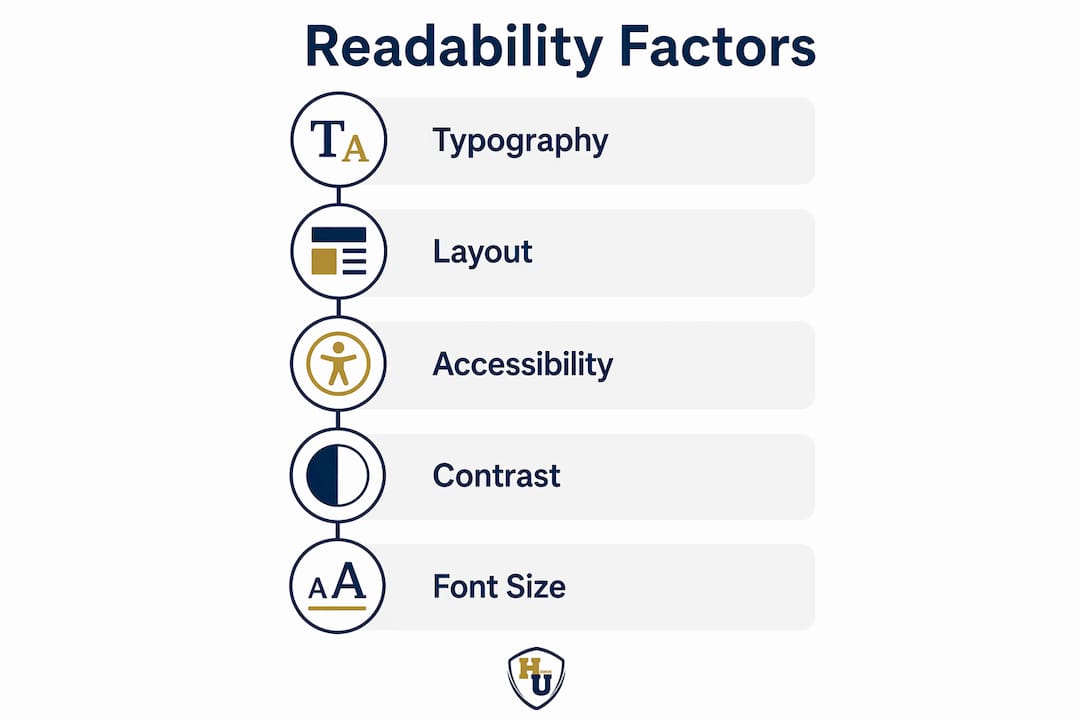
Typography specifications that professionals should apply
The table below summarizes evidence-based typography choices for formal professional documents, drawn from current research on reading speed and comprehension.
| Element | Recommended specification | Effect on reader |
|---|---|---|
| Body typeface | Helvetica, Arial, or Georgia | Faster reading times; reduced visual fatigue |
| Body font size | 11 pt minimum; 12 pt preferred | Improved comprehension and retention |
| Line spacing | 1.15 to 1.5 | Reduces crowding; supports scanning |
| Contrast ratio | 4.5:1 minimum (WCAG AA) | Accessible to readers with low contrast sensitivity |
| Heading hierarchy | H1, H2, H3 with size differentiation | Guides navigation; reduces cognitive load |
PDF accessibility introduces a structural layer that visual formatting alone cannot address. Reading order in PDFs is determined by semantic tagging within the document’s Tag Tree, not by the visual arrangement of text on the page. A screen reader follows the Tag Tree, not the layout. When a PDF is created by printing to PDF rather than exporting from the source file, the Tag Tree is flattened and the semantic structure is lost. The resulting file is, to assistive technology, a flat image with no navigable structure.
Pro Tip: Always export PDFs directly from Microsoft Word, Google Docs, or Adobe InDesign rather than using the print-to-PDF function. Exporting preserves the Tag Tree and semantic reading order; printing destroys them.
Fixing accessibility errors in tables and complex layouts is significantly harder to accomplish inside Adobe Acrobat than at the source document level. The operational best practice is to build accessibility into the source file from the start, then export correctly, rather than attempting remediation after the fact.
Common pitfalls that undermine document presentation quality
Poor document presentation follows predictable patterns. Recognizing these patterns is the first step toward eliminating them from your organization’s output.
-
Ignoring reading order and navigation hierarchy. When headings are formatted manually with bold text rather than applied as semantic heading styles, the document’s logical structure exists only visually. Screen readers and PDF tag trees cannot interpret manually bolded text as a heading, which breaks navigation for assistive technology users and disrupts the document hierarchy that guides all readers through complex content.
-
Treating documents as self-contained artifacts. A document shared without context or conversation is interpreted through each reader’s individual frame of reference. Research confirms that documents alone are necessary but not sufficient for shared understanding. Organizations that distribute policy documents, training certifications, or recognition materials without accompanying explanation consistently see higher rates of misinterpretation and follow-up questions.
-
Overlooking accessibility for key audiences. Untagged PDFs are invisible to screen readers. An organization that issues certificates or diplomas in untagged PDF format effectively excludes recipients who rely on assistive technology from accessing their own credentials. This is both an ethical failure and, in many jurisdictions, a legal compliance risk under Section 508 of the Rehabilitation Act or the Americans with Disabilities Act.
-
Defaulting to small font sizes to maximize content density. Packing more text onto a page by reducing font size below 11 pt increases cognitive load and reduces comprehension. Larger font sizes in professional documents reduce the mental effort required to read, which directly improves how much of your content the audience retains and acts upon.
-
Neglecting the physical presentation layer. Digital document design addresses on-screen readability, but physical documents such as diplomas, certificates, and formal recognition materials carry an additional dimension of perceived value. A well-designed certificate printed on quality paper and presented in a premium cover communicates institutional pride and permanence. The same certificate folded into a plain envelope communicates the opposite.
Each of these pitfalls compounds the others. An organization that uses small fonts, skips semantic tagging, and delivers documents without context has created a presentation failure at every level simultaneously.
Effective strategies to improve document presentation
The most reliable framework for improving document presentation quality is to align design decisions with how readers actually process information, rather than how authors assume they do.
-
Front-load your conclusions. The inverted pyramid structure, borrowed from journalism, places the most critical information at the top of the document and supporting detail below. Front-loading conclusions respects the reality that most professional readers scan before they read in full. Decision-makers in HR departments, academic registrars, and government agencies rarely read documents linearly. Designing for scanning behavior rather than linear reading produces documents that communicate more effectively with the audiences that matter most.
-
Apply evidence-based typography from the start. Select typefaces and sizes based on readability research rather than personal preference or template defaults. Helvetica and Arial perform well for body text in formal documents. Georgia and Times New Roman remain strong choices for print-heavy formats. Set body text at 11 to 12 pt, maintain a heading hierarchy with at least two levels of size differentiation, and target a line spacing of 1.15 to 1.5 for optimal legibility.
-
Use Adobe Acrobat’s Generate presentation tool for structured content delivery. Adobe Acrobat’s Generate presentation accepts multi-format document uploads and produces AI-powered, visually polished presentations with audience customization options. For organizations that regularly convert policy documents, training materials, or recognition program guides into presentation formats, this tool reduces production time significantly while maintaining structural integrity. You can explore how presentation tools transform documents into more impactful communication assets.
-
Build semantic structure into source files before exporting. Apply heading styles (H1, H2, H3) using your word processor’s built-in style panel rather than manual formatting. Structure tables with proper header rows. Add alt text to all images. Then export to PDF using the Save As or Export function, never the print dialog. This workflow preserves the Tag Tree that screen readers and PDF accessibility checkers depend on.
-
Pair documents with conversations. Written documents build the record; conversations build shared understanding. For high-stakes documents such as employee recognition awards, training certifications, or graduation credentials, the presentation moment itself carries as much weight as the document’s content. Delivering a certificate in a formal ceremony with a brief explanation of what it represents produces a fundamentally different outcome than emailing a PDF attachment.
Pro Tip: For physical recognition documents, the cover or holder is part of the presentation design. A diploma or certificate presented in a structured, premium cover signals institutional investment in the recipient’s achievement. This physical layer of document design is as deliberate a communication choice as the typography inside.
For organizations managing document presentation across education and HR contexts, applying all five strategies consistently produces measurable improvements in how recipients perceive the value and credibility of the documents they receive.
Well-presented vs. poorly presented documents: what the difference costs you
The gap between a well-presented document and a poorly presented one is not merely aesthetic. It translates directly into reader engagement, decision speed, and perceived organizational credibility.
| Feature | Well-presented document | Poorly presented document |
|---|---|---|
| Typography | 11 to 12 pt body text, consistent heading hierarchy | 9 to 10 pt body text, manually bolded headings |
| Accessibility | Semantic tags, proper reading order, alt text | Flattened PDF, no Tag Tree, no alt text |
| Navigation | Front-loaded conclusions, clear section breaks | Conclusions buried at end, dense paragraphs |
| Physical presentation | Premium cover, structured display format | Plain envelope, no protective holder |
| Reader outcome | Faster comprehension, higher perceived value | Increased cognitive load, reduced credibility |
| Decision-making impact | Faster approval and action | Delays, follow-up questions, misinterpretation |
A well-presented document reduces the time a reader spends orienting themselves and increases the time they spend engaging with the actual content. This efficiency gain compounds across every document an organization produces. An HR department that issues 200 training certifications per year in well-structured, accessible formats with premium physical presentation builds a reputation for institutional quality that a department issuing the same certifications in plain, unformatted PDFs does not.
The impact of presentation on readability also affects how recipients value their own credentials. Research on typography and perceived professionalism confirms that larger font sizes and cleaner layouts reduce cognitive load and enhance the perceived value of the document itself. A diploma that is easy to read and beautifully presented feels more significant than one that is visually cluttered or difficult to parse. That perception is not superficial. It reflects the real communicative work that good design performs.
Key takeaways
Effective document presentation is the combination of evidence-based typography, semantic accessibility structure, logical navigation design, and quality physical presentation working together to maximize comprehension and perceived value.
| Point | Details |
|---|---|
| Typography drives comprehension | Helvetica at 11 pt or larger produces faster reading and better retention in professional documents. |
| Semantic tagging enables accessibility | PDFs must be exported from source files to preserve Tag Trees; print-to-PDF destroys screen reader navigation. |
| Front-load conclusions | Placing key findings at the top of a document respects how professionals actually scan and read. |
| Physical presentation signals value | Premium covers and structured display formats communicate institutional investment in the recipient’s achievement. |
| Documents require conversation | Written documents alone are insufficient; pairing them with dialogue builds genuine shared understanding. |
Why document presentation deserves a seat at the strategy table
I have spent years watching organizations invest heavily in the content of their documents and almost nothing in how those documents are presented. The pattern is consistent: a beautifully researched policy document formatted in 9 pt Times New Roman with no heading hierarchy, delivered as a print-to-PDF attachment with no accompanying explanation. The authors are proud of the content. The readers are confused by the delivery.
What the research from 2026 makes clear, and what practical experience confirms, is that document design is not a finishing step. It is a communication strategy. The choice of typeface, the decision to export rather than print to PDF, the selection of a premium cover for a graduation diploma: each of these is a deliberate act of communication that shapes how the audience receives and values what you have produced.
The emergence of AI-powered tools like Adobe Acrobat’s Generate presentation is genuinely significant, not because AI replaces human judgment in document design, but because it removes the friction that causes organizations to skip the presentation step entirely. When converting a policy brief into a structured presentation takes minutes rather than hours, the barrier to doing it well drops to near zero.
My strongest recommendation is this: treat every document your organization issues as a communication product with a design specification, not just a content deliverable. Define your typography standards. Build your accessibility workflow. Choose physical presentation materials that match the significance of what you are honoring. The organizations that do this consistently are the ones whose documents get read, understood, and remembered.
— Manager
How Wehonoru supports professional document presentation
Physical document presentation is the final and often most visible layer of your organization’s communication quality. Wehonoru specializes in premium tent-style document covers designed to protect and honor diplomas, certificates, and formal recognition documents with the prestige they deserve.
Whether you are presenting a single graduation diploma or outfitting an entire corporate recognition program, Wehonoru’s classic diploma covers deliver a polished, professional finish with next-day production and no minimum order requirement. For institutions that want to reinforce their brand identity at the moment of recognition, custom metallic foil covers with printed logos and text transform a standard certificate into a lasting keepsake. Explore the full range of presentation solutions at WeHonorU.com and give every achievement the presentation it has earned.
FAQ
What is the purpose of document presentation?
Document presentation is the deliberate design and structuring of a document to maximize clarity, comprehension, and perceived value for a specific audience. It encompasses typography, layout, reading order, accessibility compliance, and physical presentation format.
How does font choice affect document readability?
Research shows that Helvetica at 11 pt produces the fastest reading times, and larger font sizes consistently improve comprehension. Choosing the wrong typeface or using font sizes below 11 pt increases cognitive load and reduces how much readers retain.
Why do PDFs lose accessibility when printed to PDF?
Printing to PDF flattens the document’s semantic Tag Tree, which screen readers use to navigate content. Exporting directly from the source file in Microsoft Word or Adobe InDesign preserves the Tag Tree and maintains accessibility for users of assistive technology.
How does physical presentation affect the perceived value of a diploma or certificate?
A diploma or certificate presented in a premium structured cover signals institutional investment and respect for the recipient’s achievement. The physical presentation layer communicates quality and permanence in ways that digital formatting alone cannot replicate.
What is the inverted pyramid structure in document design?
The inverted pyramid structure places the most critical information at the top of a document and supporting detail below. This approach aligns with how professional readers actually scan documents, improving comprehension and reducing the time needed to reach key conclusions.