Certificate Covers and Their Role in Professional Branding

TL;DR:
- Certificate covers are strategic branding tools that visually communicate issuer identity and credibility during credential presentations. They enhance long-term visibility through photographs and sharing, especially when combining premium physical covers with digital badges for verification. Proper design, early procurement, and effective presentation processes maximize their impact and reinforce organizational authority.
Certificate covers are defined as protective presentation folders that simultaneously function as branded trust instruments, communicating issuer identity and organizational credibility at the moment a credential changes hands. The role of certificate covers in professional branding extends far beyond physical protection. A well-designed cover bearing your institution’s logo, brand colors, and premium finish tells the recipient, and every observer in the room, exactly who issued that credential and what it represents. Organizations that treat covers as afterthoughts miss a high-visibility branding opportunity that persists long after the ceremony ends. Wehonoru works with schools, corporate HR teams, healthcare organizations, and government agencies to deliver covers that carry the full weight of the issuer’s reputation.
How certificate covers build and reinforce professional credibility
Certificate covers build professional credibility by making issuer identity the first visual element a recipient and audience encounter, before the document itself is ever opened. This is not a minor distinction. In a graduation ceremony, a boardroom recognition event, or a healthcare credentialing presentation, the cover is what the camera captures, what guests see from a distance, and what recipients hold up for photographs. The cover is the brand’s first and most durable impression.

Issuer logo and name prominence is the top visual priority for professional certificates in 2026, with guidance recommending that viewers recognize the issuing organization within a second of seeing the document. That same principle applies directly to covers. A cover that buries the institution’s name in small type or omits the logo entirely forfeits the branding value of the entire presentation.
Physical covers also function as what UX researchers describe as relational objects. According to research on cover design and identity, recipients keep, photograph, and share objects that communicate their identity publicly, transforming a single presentation moment into an ongoing brand signal. This means that a certificate cover bearing your organization’s logo continues working as a brand touchpoint every time a recipient posts a photo on LinkedIn, displays the credential in an office, or shares it with family. The cover outlasts the ceremony by years.
Third-party verification adds another layer of credibility. Trustindex’s Top Rated certificate, for example, requires a 4.5+ rating across select platforms over the prior 12 months before an organization can display the badge. This standard illustrates how certificates tied to objective, verifiable criteria carry significantly more brand authority than decorative documents alone. Physical covers that visually reinforce those standards, through premium materials and clear issuer branding, amplify that authority rather than dilute it.
“Branding works best when covers emphasize issuer identity as a trust surface, not just decoration, to maximize certificate authority.” — TrueOriginal, 2026
The practical implication for organizational leaders is straightforward. Your certificate cover is not a commodity supply item. It is a branded communication tool that carries your reputation into the recipient’s home, office, and social media feed. Treat it accordingly.
- Issuer logo placement: Position the logo at the top center or top left of the cover exterior for immediate recognition in photos and presentations.
- Brand color consistency: Match cover colors to your official brand palette, not generic stock colors, to reinforce visual identity.
- Material quality: Premium stock, linen textures, or metallic foil finishes signal organizational prestige before the cover is even opened.
- Minimal clutter: A clean cover design with logo, institution name, and a single design element reads as authoritative. Overcrowded covers read as amateur.
- Durability: Covers that hold their shape and finish over years of display continue projecting your brand long after the initial presentation.
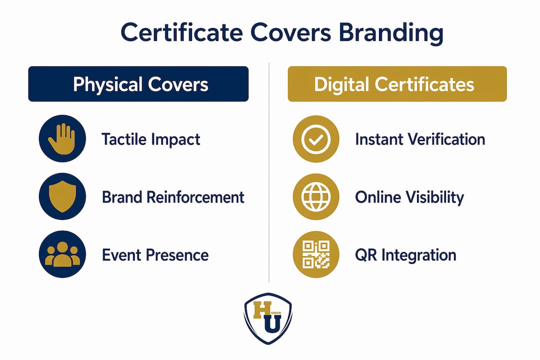
Physical vs. digital certificates: which format serves branding better?
Physical certificate covers and digital certificate badges serve different branding functions, and the most effective organizations deploy both rather than choosing one over the other. Understanding where each format excels allows you to allocate your presentation budget with precision.
Digital certificates issued on blockchain with scannable QR codes allow instant online verification and support brand visibility through sharing on LinkedIn, personal websites, and professional portfolios. When a recipient shares a digital badge, the link traces back to the issuing organization’s domain, generating ongoing referral traffic and brand impressions at no additional cost. For organizations focused on online reputation and professional network visibility, digital credentials deliver measurable marketing value.
Physical covers, by contrast, create tactile and visual brand reinforcement that digital formats cannot replicate. The weight of a premium linen cover, the reflection of a gold foil imprint, and the formal act of presenting a document in a branded folder carry ceremonial gravity that a PDF or a LinkedIn badge simply does not. For graduation ceremonies, employee recognition events, healthcare credentialing, and military commendations, the physical presentation is the moment. The cover is the artifact that marks it.
| Format | Primary branding strength | Best use case | Verification method |
|---|---|---|---|
| Physical cover | Tactile prestige, ceremony impact, long-term display | Graduations, award ceremonies, credential presentations | Visual inspection, issuer logo |
| Digital badge | Online shareability, verifiable authenticity, network reach | LinkedIn profiles, email signatures, online portfolios | QR code, blockchain record |
| Combined approach | Maximum trust and visibility across all channels | Professional certifications, institutional credentials | Both physical and digital |
The combined approach delivers the strongest branding outcome. Effective certificate branding combines physical presentation and digital verification to maximize trust, shareability, and long-term brand visibility. A recipient who receives a premium physical cover at a ceremony and also receives a digital badge to share online becomes a brand ambassador across two entirely different audiences simultaneously.
Pro Tip: When ordering custom covers for a certification program, include a printed QR code insert inside the cover that links to the recipient’s digital credential. This connects the physical and digital experience without altering the cover’s exterior design.
For organizations deciding where to prioritize investment, the decision depends on audience and context. Corporate HR teams recognizing employees benefit most from physical covers that create a memorable in-person moment. Online education platforms issuing certificates to remote learners benefit most from digital badges. Institutions serving both in-person and remote audiences, such as universities with hybrid programs, should budget for both formats as part of a unified professional branding materials strategy.
Key design principles for certificate covers that maximize branding
Effective certificate cover design follows a clear hierarchy: issuer identity first, document protection second, and aesthetic appeal third. Organizations that invert this order produce covers that look attractive but fail to communicate authority.
The following numbered principles reflect current best practice for cover design in professional and institutional contexts:
-
Lead with the issuer logo. The logo should occupy the most prominent position on the cover exterior, sized large enough to be legible in photographs taken from several feet away. Instant issuer recognition requires logo and organization name to be the dominant visual elements, with high contrast against the cover background.
-
Select materials that match your brand tier. Linen-textured paper stock communicates tradition and academic prestige. Smooth matte finishes read as modern and corporate. Metallic foil imprints, available in gold, silver, and other colors, add a premium quality that recipients associate with significant achievement. The material choice is a brand statement in itself.
-
Apply brand colors with precision. Generic navy or burgundy covers are forgettable. A cover printed in your institution’s exact Pantone color, with your logo in gold foil, is unmistakably yours. Color consistency across all professional branding materials, from covers to programs to signage, reinforces brand recognition at every touchpoint.
-
Keep the exterior design clean. One logo, one institution name, and one optional design element such as a seal or tagline. Every additional element competes for attention and reduces the authority of the primary brand mark.
-
Design for photography. Certificates are photographed constantly at ceremonies and shared widely on social media. Covers with high-contrast logos, reflective foil finishes, and clean layouts photograph well and extend your brand’s reach organically.
-
Consider the interior. The inside of a cover, often overlooked, is the first thing a recipient sees when opening it. A branded interior panel, a congratulatory message in your organization’s voice, or a subtle watermark pattern reinforces the brand experience at the moment of maximum emotional impact.
Operational planning is as important as design. Production lead times and setup fees directly affect your ability to deliver covers on time for scheduled events. Setup charges for gold foil imprinting typically run approximately $10 per design, and standard production readiness for custom orders runs approximately five business days. Organizations that treat covers as a last-minute supply purchase routinely face shortages, substitutions, or plain covers that undermine the entire presentation.
| Planning stage | Recommended timeline | Key action |
|---|---|---|
| Design approval | 4 weeks before event | Finalize logo files, brand colors, cover dimensions |
| Order placement | 3 weeks before event | Submit artwork, confirm quantities, pay setup fees |
| Production and shipping | 1 to 2 weeks before event | Confirm tracking, inspect samples on arrival |
| Contingency buffer | 3 to 5 business days | Reserve time for reprints or corrections |
Pro Tip: Order a small sample run of 5 to 10 covers before committing to full quantity. Reviewing a physical sample under event lighting conditions reveals color accuracy and foil quality issues that digital proofs consistently miss.
For organizations managing bulk certificate holder procurement across multiple departments or campuses, centralizing the design approval process and establishing a single approved cover template prevents brand inconsistency across different ordering cycles.
Best practices for presenting certificates with covers to maximize impact
Presentation style determines how much branding value you extract from a well-designed cover. A premium cover handed over casually in a hallway delivers a fraction of the brand impact of the same cover presented formally at a dedicated ceremony.
The following practices consistently produce stronger brand association and recipient satisfaction:
- Create a dedicated presentation moment. Whether it is a stage walk at graduation, a team meeting recognition, or a one-on-one manager presentation, the act of formally handing a covered certificate signals that the achievement matters. Recipients remember the moment, and the cover becomes the physical anchor of that memory.
- Brief presenters on the cover’s significance. Presenters who hold the cover with both hands, face the audience, and pause before handing it to the recipient create a visual moment that photographs and videos capture effectively. This is free brand amplification.
- Encourage recipients to photograph and share. Place a brief note inside the cover, or include verbal encouragement during the ceremony, inviting recipients to share their achievement on LinkedIn or other professional networks. Recipients who share photos of a branded cover extend your organization’s visibility to their entire professional network.
- Align cover design with your broader brand voice. A law firm presenting bar admission certificates should use covers that reflect the firm’s formal, traditional identity. A technology company recognizing internal certifications might use a cleaner, more modern cover design. The cover should feel like a natural extension of your organization’s visual identity, not a generic product.
- Use covers consistently across all recognition programs. Inconsistency, where some certificates receive premium covers and others receive plain folders, signals that some achievements matter more than others. Consistent cover use across all programs reinforces a culture of recognition.
For internal audiences such as employee recognition programs, the cover also serves a retention function. Employees who receive a premium, branded cover for a training completion or tenure milestone are more likely to display it in their workspace, reinforcing their connection to the organization. For external audiences, such as clients receiving professional certifications or partners receiving acknowledgment documents, the cover communicates the issuing organization’s standards and attention to detail.
Integrating certificate covers with broader professional branding materials creates a cohesive brand experience. When covers, programs, signage, and digital communications share the same visual language, the cumulative effect on brand perception is substantially stronger than any single element alone.
Key takeaways
Certificate covers are the most underutilized branding asset in professional recognition programs, and organizations that treat them as strategic tools rather than supply items gain measurable credibility advantages.
| Point | Details |
|---|---|
| Covers are trust instruments | Issuer logo and brand colors on a cover communicate organizational authority before the document is read. |
| Physical and digital work together | Combining premium physical covers with digital badge credentials maximizes both ceremony impact and online brand visibility. |
| Design hierarchy matters | Lead with issuer identity, use premium materials, and keep the exterior clean for maximum recognition in photos and displays. |
| Operational planning prevents failure | Custom covers require production lead times of approximately five business days; order early to avoid event-day shortages. |
| Presentation style amplifies value | Formal presentation moments and recipient sharing encouragement multiply the branding return on every cover produced. |
Why certificate covers deserve a seat at the branding table
I have reviewed hundreds of recognition programs across education, corporate HR, and healthcare, and the pattern is consistent: organizations spend significant resources designing the certificate itself and almost nothing on how it is delivered. The cover is ordered from a generic catalog, arrives in a color that does not match the brand, and gets handed out in a stack at the end of a ceremony. The credential is real. The presentation undermines it.
What I find most overlooked is the photography dimension. Every graduation, every employee recognition event, and every credentialing ceremony produces photographs that circulate on social media, internal communications, and organizational websites for years. The cover is in every one of those photographs. If it carries your logo in gold foil on a color-matched background, every photograph is a brand impression. If it is a plain black folder, every photograph is a missed opportunity.
The integration of physical covers with digital credentials is the most significant shift I have seen in this space recently. Organizations that issue a premium physical cover at a ceremony and simultaneously send a digital badge linked to a verifiable record are creating a brand presence that operates across two entirely different audience contexts. The physical cover works in the room. The digital badge works on LinkedIn for the next decade. The cost difference between doing both and doing only one is minimal. The brand impact difference is substantial.
The one operational mistake I see repeatedly is treating covers as a last-minute procurement item. Custom foil printing requires lead time. Artwork approvals take longer than expected. Shipping delays happen. Organizations that build cover procurement into their event planning timeline, with the same discipline they apply to venue booking or catering, never face the embarrassment of presenting credentials in plain folders because the custom order did not arrive in time.
Covers are not decoration. They are the physical embodiment of your organization’s commitment to the achievement they contain. Design them that way, present them that way, and the branding return will follow.
— Manager
Elevate your next recognition event with Wehonoru
Wehonoru designs and produces premium certificate covers built specifically for organizations that take their branding seriously. Every cover ships within one business day of order placement, with no minimum order quantity and no setup fees, so you can order exactly what you need for any event size.
Wehonoru’s tent-style covers feature metallic foil printing in your choice of colors, made-to-fit sizing for non-standard documents, and material options that project the prestige your credentials deserve. Whether you are outfitting a university graduation, a corporate training program, or a healthcare credentialing ceremony, the classic tent-style diploma cover delivers the quality and brand consistency your recognition program requires. Explore the full product line at Wehonoru.com and place your order today.
FAQ
What are certificate covers used for in professional settings?
Certificate covers are presentation folders used to protect and display credentials at graduation ceremonies, employee recognition events, and professional credentialing presentations. They serve as branded trust instruments that communicate issuer identity and organizational prestige at the moment of presentation.
How do custom certificate covers improve professional branding?
Custom certificate covers carry the issuing organization’s logo, brand colors, and premium finishes, making the issuer instantly recognizable in person and in photographs. Recipients who display and share branded covers extend the organization’s brand visibility well beyond the original ceremony.
What design elements matter most on a certificate cover?
Issuer logo prominence, brand color accuracy, and a clean exterior layout are the three highest-priority design elements. Professional certificate design guidance recommends that the issuing organization be identifiable within one second of viewing the cover.
How far in advance should organizations order custom certificate covers?
Organizations should place custom cover orders at least three weeks before the event to account for design approval, production, and shipping. Standard production readiness for custom foil-printed covers runs approximately five business days, and building in a contingency buffer prevents last-minute shortages.
Should organizations use both physical covers and digital certificates?
Yes. Physical covers create ceremony impact and long-term display value, while digital certificates with QR codes support online verification and LinkedIn shareability. Using both formats simultaneously maximizes brand reach across in-person and professional network audiences.