
Certificate Display Best Practices for Educators and HR Pros

TL;DR:
- Effective certificate display enhances recognition by communicating credibility and respect through quality materials and presentation techniques. Proper framing, layout design, ceremony protocol, and digital verification ensure recipients feel genuinely honored and their achievements properly valued. Attention to detail in materials, display, and inclusivity reinforces organizational culture and elevates recognition events.
Certificate display best practices are defined as the methods, materials, and presentation techniques that ensure a certificate communicates clearly, commands respect, and honors the recipient with lasting impact. Whether you manage graduation ceremonies at a K–12 school, run employee recognition programs in a corporate HR department, or coordinate award events as a professional planner, how you present a certificate shapes how the achievement is perceived. A poorly framed diploma or a rushed handout undercuts the significance of the moment. This guide covers the full spectrum of professional certificate display, from physical framing and design layout to live ceremony technique and digital credentialing, so every certificate you present reflects the standard the recipient deserves.

1. Certificate display best practices: why they matter more than you think
Professional certificate display is not simply about aesthetics. It is about communicating institutional credibility and genuine respect for the recipient’s effort. A certificate presented in a quality cover or frame signals that the organization takes recognition seriously. That signal matters to recipients, to their families, and to colleagues watching from the audience.
The educational certificate display process follows recognized standards that balance visual clarity, material durability, and ceremony protocol. Schools, HR departments, and event planners who follow these standards consistently report stronger engagement during recognition events. The physical and visual quality of the presentation reinforces the emotional weight of the moment.
Treating certificate display as an afterthought is the most common mistake organizations make. When a diploma is handed over in a plain manila envelope or a flimsy folder, the message sent is that the achievement is routine. The goal of every display decision, from frame choice to font size to ceremony timing, is to make the recipient feel genuinely honored.
2. What are the top materials and framing options for professional certificate display?
The frame or cover you choose is the first physical statement your organization makes about the value of the achievement. Frame sizing must match the certificate dimensions precisely. The most common standard is 8.5 x 11 inches, and frames that do not fit this dimension create visible gaps or force the document to buckle, both of which undermine the professional appearance.
Three frame types dominate the professional market: self-adhesive frames, magnetic frames, and archival-quality rigid frames. Each serves a different context.
| Frame Type | Key Features | Best Use |
|---|---|---|
| Self-adhesive frames | Lightweight, low cost, easy to mount | Bulk ceremony handouts, classroom awards |
| Magnetic frames | Tool-free assembly, clean edges, reusable | Corporate HR recognition, office display |
| Archival-quality rigid frames | UV-protective glass, acid-free matting, heirloom durability | Diplomas, board certifications, long-term wall display |
| Tent-style document covers | Freestanding, metallic foil printing, no wall mounting needed | Ceremony tables, desk display, event presentations |
| Padded certificate folders | Soft interior lining, professional exterior, portable | Ceremony handouts, mailed awards, gift presentations |
Archival frames protect documents from UV fading and acid degradation over decades. That level of protection is appropriate for diplomas and professional licenses that recipients will keep for life. For high-volume ceremony handouts, tent-style covers and padded folders offer a professional presentation at a practical price point.
Material finish also matters. Matte black and brushed silver frames read as contemporary and professional in most office environments. Gold-toned frames carry a traditional, formal weight that suits academic and government settings. The frame should complement the certificate design without competing with it visually.
Pro Tip: Before ordering frames in bulk, place one sample certificate inside the frame and view it from ten feet away. If the frame draws your eye before the recipient’s name does, choose a simpler option.
3. How to design a certificate layout for maximum visual clarity
The recipient’s name is the single most important element on any certificate. Font size of 28–36pt with central positioning gives the name the visual dominance it deserves. A reader should be able to identify the recipient’s name within five seconds of looking at the certificate. If that test fails, the layout needs revision.
Typography discipline is the second critical factor. Limit the design to two typefaces: a classic serif font for the recipient’s name and primary text, and a clean sans-serif for supporting details like dates, titles, and issuing authority. Using three or more typefaces creates visual noise that undermines the certificate’s authority.
Color restraint follows the same logic. Limit the palette to two or three colors. Neutral backgrounds, such as cream, white, or light gray, paired with gold or silver accents, produce a timeless result. Borders should be simple and consistent. Decorative borders that compete with the text reduce legibility and age poorly.
The industry standards for certificate holders reinforce these design principles with specific guidance on white space, margin widths, and seal placement. White space is not wasted space. It gives the eye a place to rest and directs attention to the name and issuing organization.
Key design guidelines for professional certificates:
- Recipient name: 28–36pt font, centered, bold or italic serif typeface
- Issuing organization name: 14–18pt, positioned above or below the recipient name
- Certificate title (e.g., “Certificate of Completion”): 16–20pt, clearly distinct from the name
- Date and signature lines: 10–12pt, placed in the lower third of the document
- Seals and logos: positioned in corners or below the signature block, never overlapping text
- Borders: single or double line, consistent weight, no more than 0.25 inches from the document edge
Pro Tip: Add a QR code for authenticity verification in the lower corner of the certificate. It adds digital trust without cluttering the design and allows recipients to share verified credentials instantly.
4. Effective certificate presentation tips during ceremonies
Live ceremony presentation is where design and logistics meet human emotion. The sequence matters as much as the materials. Call the recipient’s name, pause, make direct eye contact, and hand the certificate personally. That four-step sequence transforms a routine handout into a genuine recognition moment. Skipping any step, particularly the pause and eye contact, creates the assembly-line effect that makes large ceremonies feel impersonal.
Speech length is a discipline that most presenters underestimate. Limit award speeches to 2–3 minutes per recipient group, and allow approximately 15 seconds of individual acknowledgment per person for eye contact and a brief personal word. That timing keeps the ceremony moving while preserving the dignity of each recognition moment.
Vague praise is the most damaging mistake a presenter can make. Saying “Sarah has been a great employee” communicates nothing memorable. Saying “Sarah led the onboarding redesign that reduced new hire ramp time by six weeks” gives the recognition specific weight. Specific examples of achievement create authentic recognition moments that recipients remember and colleagues respect.
Ceremony presentation do’s and don’ts:
- Do rehearse name pronunciations before the event
- Do position the presenter and recipient so the audience can see both faces
- Do use a podium or table at a consistent height to avoid awkward handoffs
- Don’t read the certificate text aloud verbatim; the certificate speaks for itself
- Don’t rush through names to save time; pace the ceremony with dignity
- Don’t hand certificates face-down or in a stack; present each one open and visible
- Don’t allow side conversations during individual presentations
For large corporate HR events with 50 or more recipients, consider grouping awards by department and assigning a department leader to co-present. This distributes the recognition across the organization and reduces the time burden on a single presenter.
5. Digital and website display best practices for certifications
Online certificate display follows different rules than physical presentation, but the core principle is identical: clarity and verifiability build credibility. The most common mistake organizations make with digital certification display is using vague marketing language. Phrases like “We are certified” or “Award-winning quality” carry no verifiable weight.
Use precise ISO certification phrasing such as “ISO 9001:2015 Certified | Cert No. XXXXXX” with a scope note and a link to the verification page. That format satisfies auditors, builds trust with clients, and demonstrates transparency. Organizations that display full certification details, rather than simplified marketing claims, project a higher level of professional confidence.
| Digital Display Option | Pros | Cons |
|---|---|---|
| Website footer badge | High visibility, persistent presence | Can appear decorative without verification link |
| Dedicated credentials page | Full detail, easy to update, linkable | Requires maintenance; low organic traffic |
| Email signature block | Reaches every contact directly | Limited space; must be concise |
| LinkedIn profile certifications | Professional network visibility | Platform-dependent; no custom branding |
| QR code on physical certificate | Links physical and digital instantly | Requires active URL maintenance |
For email signatures, include the certification name, the issuing body, and the certificate number on a single line. Link the certification name to the issuing body’s verification page. That approach keeps the signature clean while giving recipients a direct path to confirm authenticity.
LinkedIn’s certification section accepts the issuing organization, credential ID, and a verification URL. Filling all three fields signals thoroughness and makes the credential searchable. Leaving fields blank reduces the credential’s professional impact.
Transparency with full scope details builds professional trust that vague claims cannot replicate. Organizations that display complete certification information consistently earn stronger credibility with clients, partners, and regulatory bodies.
6. How to choose the right certificate cover for your event format
The cover or holder you select should match both the document size and the event context. A tent-style cover works well for table displays and desk presentations because it stands independently without requiring a frame or wall mount. A padded folder suits mailed awards and ceremony handouts because it protects the document during transport and opens cleanly in the recipient’s hands.
Custom sizing is a practical necessity that many organizations overlook until the last minute. Standard 8.5 x 11 inch covers fit most academic and corporate certificates. However, trade school completions, military commendations, and specialty professional licenses often use non-standard dimensions. A cover that does not fit the document forces the recipient to fold or trim the certificate, which defeats the purpose of professional presentation entirely.
The guide to designing a certificate cover outlines how to match cover dimensions to document size, select appropriate foil colors, and incorporate institutional branding without overwhelming the certificate itself. Metallic foil printing on the cover exterior adds a prestige finish that reinforces the value of the credential inside.
For bulk orders, consistency matters as much as quality. Every recipient at a graduation ceremony or corporate recognition event should receive an identical cover. Variation in cover quality across a single event sends an unintended message about the relative value of different recipients’ achievements.
7. Accessibility and inclusivity in certificate presentation
Accessible certificate presentation means every recipient can receive and display their award with equal dignity. Font size on the certificate itself directly affects recipients with visual impairments. The 28–36pt standard for the recipient’s name is a minimum, not a ceiling. For events where recipients may have low vision, increasing the name to 40pt and using high-contrast color combinations, such as black text on a white or cream background, improves readability without compromising the design.
Physical handoff logistics also require planning. Recipients who use wheelchairs, crutches, or other mobility aids need a presentation setup that does not require them to climb stairs or navigate a narrow stage. A ground-level presentation area with a clear path is a straightforward accommodation that demonstrates organizational respect.
For digital certificates, screen reader compatibility is a practical requirement. Certificates saved as image files are invisible to screen readers. Saving the certificate as a tagged PDF with alt text for the recipient’s name and issuing organization ensures that recipients using assistive technology can access their credential fully.
Suraasa’s work in educational recognition contexts highlights that authentic, accessible recognition practices strengthen the relationship between institutions and the individuals they serve. Accessibility in certificate display is not a compliance checkbox. It is an expression of the same respect that motivates the recognition in the first place.
Key Takeaways
Professional certificate display requires consistent attention to materials, design, ceremony technique, and digital presentation to honor recipients with the credibility their achievements deserve.
| Point | Details |
|---|---|
| Frame and cover selection | Match the frame or cover to the exact document size and event context for a professional result. |
| Design clarity | Use 28–36pt font for the recipient’s name, limit to two typefaces, and restrict the palette to two or three colors. |
| Ceremony technique | Call names clearly, pause for eye contact, and use specific praise rather than generic compliments. |
| Digital display precision | Include certification number, issuing body, and a verification link for every credential displayed online. |
| Accessibility | Use high-contrast design, tagged PDFs, and ground-level handoff logistics to honor every recipient equally. |
What I’ve learned about certificate display after years in the recognition industry
The most persistent gap I see between organizations that do recognition well and those that do it adequately is not budget. It is intentionality. A school that spends carefully on quality covers and rehearses name pronunciations creates a ceremony that graduates remember for decades. A corporation that prints a certificate on plain paper and slides it across a conference table table communicates, however unintentionally, that the achievement was routine.
The design principles in this guide, particularly the two-typeface rule and the five-second legibility test, are not arbitrary style preferences. They are the result of accumulated professional experience across thousands of ceremonies and recognition events. Visual noise on a certificate is not neutral. It actively reduces the perceived value of the credential.
The detail that surprises most HR professionals is how much ceremony timing matters. Fifteen seconds of genuine eye contact and a specific, personal word during a handoff costs nothing. It transforms a logistical transaction into a memory. That is the standard every recognition event should aim for, regardless of scale or budget.
Certificate display is ultimately an expression of organizational culture. When you present a certificate with care, you tell the recipient that their effort was seen, valued, and worth commemorating properly. That message outlasts the ceremony itself.
, Manager
Wehonoru’s tent-style covers for professional certificate presentation
Wehonoru’s Classic Diploma Tent-Style Document Cover is built for organizations that take presentation seriously. The cover stands independently on any flat surface, making it ideal for ceremony tables, desk displays, and award events where wall mounting is not practical.
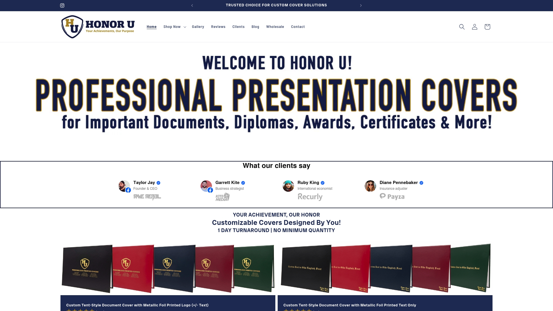
Wehonoru produces every cover with metallic foil printing and ships orders in one business day with no minimum order quantity. Custom sizing is available for non-standard documents, and institutional logos and text can be added to the exterior. Free shipping applies to orders over $35. Whether you are preparing covers for a class of five or a corporate recognition event for five hundred, Wehonoru delivers the same quality and turnaround every time.
FAQ
What font size should a recipient’s name be on a certificate?
The recipient’s name should appear at 28–36pt font size with central positioning. This ensures the name is the most visually dominant element and passes the five-second legibility test.
How long should an award presentation speech be?
Award speeches should run 2–3 minutes per recipient group, with approximately 15 seconds of individual acknowledgment per person for eye contact and a personal word.
What is the correct way to display ISO certification online?
Display ISO certification using precise phrasing such as “ISO 9001:2015 Certified | Cert No. XXXXXX” and include a link to the verification page. Vague marketing claims reduce credibility with clients and auditors.
What frame size fits most certificates and diplomas?
The standard certificate size is 8.5 x 11 inches, and frames or covers should match this dimension exactly to prevent buckling or visible gaps that undermine the professional appearance.
Should certificates include a QR code?
Yes. A QR code placed discreetly in a corner of the certificate links to a verification page, adds digital trust, and allows recipients to share authenticated credentials without cluttering the design.
Recommended
Taylor Pace writes Honor U guides. Blair Black reviews them. Honor U sells empty covers and holders.