
Defining Recognition and Awards Stationery: 2026 Guide

TL;DR:
- Recognition and awards stationery documents achievement through certificates, diplomas, and covers designed with a clear structure. They must include five core elements, use consistent design hierarchy, and match categories such as awards or appreciation certificates with appropriate quality and language tone. Combining physical recognition with digital verification enhances credibility and extends the recognition’s impact.
Recognition and awards stationery is defined as the complete set of printed materials used to formally document and present an achievement, honor, or credential to a recipient. This category includes certificates, diplomas, presentation folders, and award covers, each governed by a standardized 4-layer structure: identity, award title, recipient name, and authorization. Defining recognition and awards stationery correctly matters because the physical document is often the only lasting artifact of a significant milestone. Whether you represent a school district, a corporate HR department, or a nonprofit honoring volunteers, the quality and clarity of these materials directly shape how recipients and observers perceive the achievement itself.
What are the essential components of recognition and awards stationery?
Professional recognition stationery follows a clear content hierarchy. Every element on the page serves a specific function, and omitting even one weakens the document’s authority.
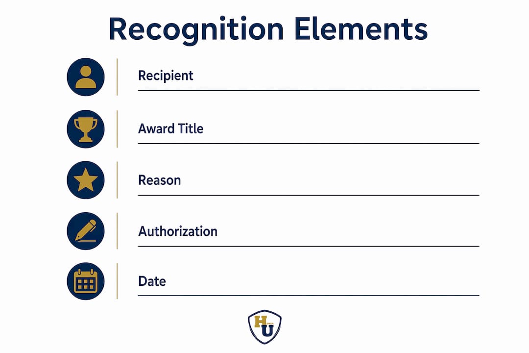
The five core elements required for clarity and authority are:
- Recipient’s full name: Spelled correctly and prominently placed. A misspelled name undermines the entire document’s credibility.
- Award title: Specific and unambiguous. “Employee of the Quarter” communicates more than “Recognition Award.”
- Reason for the award: A concise statement explaining what was achieved or demonstrated.
- Issuing organization: The full legal or institutional name, not an abbreviation, unless the abbreviation is universally recognized.
- Official date: The month, day, and year the award is conferred, not the date it was printed.
These five elements apply whether the document is a formal university diploma or a personalized recognition card presented at a team meeting. The standard certificate size is 8.5x11 inches, though smaller mail-friendly formats around 4x8 inches are common when documents need to be shipped to recipients. Smaller formats require that all text remains legible from 2–3 feet away, which demands careful font sizing and layout decisions.
Authorization is the element most frequently underestimated. A signature line, an official seal, or both signal that the document carries institutional weight. Without visible authorization, even a beautifully designed certificate reads as informal.

Pro Tip: Always proof the recipient’s name against an official source, such as a registration record or HR file, before sending any recognition document to print. A single letter error on a diploma or award certificate requires a costly reprint and delays the recognition moment.
Design considerations shift based on document size. Large certificates at 8.5x11 inches allow for decorative borders, institutional seals, and multi-line award language. Smaller presentation pieces must prioritize the five core elements above all decorative choices. When space is limited, the recipient’s name and award title take visual priority over logos and borders.
How do awards, certificates, and appreciation documents differ?
The terms “award,” “certificate of achievement,” and “appreciation certificate” are used interchangeably in many organizations. That practice creates confusion and dilutes the meaning of each document type. Awards, certificates of achievement, and appreciation certificates serve distinct roles: competitive ranking, merit recognition, and gratitude, respectively.
| Document type | Primary purpose | Typical language tone | Design weight |
|---|---|---|---|
| Award | Recognizes competitive or ranked achievement | Formal, declarative | Heavy; premium paper, foil accents |
| Certificate of achievement | Confirms a skill, milestone, or learning benchmark | Professional, affirming | Moderate; clean layout, institutional branding |
| Appreciation certificate | Expresses gratitude for contribution or service | Warm, personal | Lighter; may include color and softer design elements |
Selecting the correct document type affects more than wording. It determines paper stock, finish, and the overall visual weight of the piece. An award presented at an annual gala warrants heavier card stock, metallic foil printing, and a formal presentation cover. An appreciation certificate distributed at a team lunch can use standard paper with a clean, branded layout.
Common misconceptions in this area include:
- Treating all three types as interchangeable when the occasion calls for a specific form of recognition.
- Using formal diploma language on an appreciation certificate, which creates a tone mismatch that recipients notice.
- Applying the same template across all recognition categories, which undermines effectiveness and clarity when recipients compare documents from the same organization.
Organizations that run school award programs benefit from separating these categories early in the planning process. A well-organized school awards program assigns each recognition type its own template, language guide, and presentation format before the ceremony date. That separation protects the perceived value of every document issued.
The psychological impact of getting this right is real. Awards, achievement certificates, and appreciation certificates each trigger different emotional responses in recipients. An award signals that the recipient outperformed peers. A certificate of achievement confirms competence. An appreciation certificate communicates that the recipient’s effort was seen and valued. Mixing these signals on a single template produces a document that communicates none of them clearly.
Which design principles build prestige and trust in recognition materials?
Layout and spacing are functional elements, not purely aesthetic ones. Clutter dilutes authority, while clear visual hierarchies signal professionalism and institutional credibility. This is the most overlooked truth in recognition certificate design.
Font hierarchy and logo placement
A certificate should use no more than two typefaces: one for display text such as the award title and recipient name, and one for body text such as the reason for the award and date. The display font carries the emotional weight of the document. The body font provides legibility and structure. Mixing three or more typefaces creates visual noise that competes with the content itself.
Logo placement follows a consistent rule across professional recognition materials: the issuing organization’s mark appears at the top center or top left, anchoring the document’s authority before the recipient reads a single word. Consistent font hierarchy, logo placement, and border styles increase perceived prestige and build long-term brand recognition across all materials an organization produces.
Brand colors and standardized templates
Brand colors applied consistently across all recognition materials create a visual identity that recipients associate with quality and credibility. A university that uses its official navy and gold on every diploma, certificate, and presentation folder trains recipients and observers to recognize those materials as authoritative. Standardized frameworks in design maintain organizational brand authority even as the content of individual documents changes from year to year.
Templates serve a practical function beyond aesthetics. They reduce design errors, maintain consistency across large batches of personalized recognition cards, and allow non-designers in HR or administrative roles to produce professional materials without specialized software skills.
Pro Tip: Lock your logo, border, and color elements as non-editable layers in your template file. Leave only the recipient name, award title, date, and reason fields editable. This prevents accidental changes to brand elements during high-volume production runs.
Digital verification integration
Pairing physical certificates with digital verification through QR codes or online links turns a keepsake into a portable, verifiable credential. A scannable QR code printed in the lower corner of a certificate links to a hosted verification page, allowing employers, academic institutions, or professional bodies to confirm the award’s authenticity instantly. Digital badges complement the physical document by providing a shareable credential recognized on platforms like LinkedIn. This combination delivers the emotional impact of a tangible artifact and the practical utility of a digital record.
For a detailed look at how presentation covers support these design goals, Wehonoru’s guide on certificate cover design covers the step-by-step process for creating covers that reinforce the authority of the document inside.
What steps should you follow when creating recognition stationery?
Creating effective awards stationery ideas requires a structured process. The following steps apply to both individual orders and large institutional programs.
-
Define your recognition categories first. List every type of recognition your organization issues: competitive awards, achievement certificates, appreciation certificates, and any specialty documents such as diplomas or professional credentials. Assign each category its own template, language guide, and design weight before any design work begins.
-
Establish editorial rules per category. Formal language suits diplomas and competitive awards. Warmer, more personal language fits appreciation certificates. Write a one-paragraph style guide for each category and share it with everyone who drafts award language. This prevents tone mismatches that undermine the document’s message.
-
Separate fixed branding elements from personalized fields. Your logo, border, color palette, and institutional name are fixed. The recipient’s name, award title, reason, and date are personalized. Keeping these layers separate in your template file protects brand consistency across hundreds of individual documents.
-
Choose the appropriate presentation format. A diploma or degree cover warrants a premium presentation folder or tent-style document cover. A monthly employee recognition card may need only a clean printed card in a standard envelope. Matching the presentation format to the occasion signals that the organization takes the recognition seriously. Wehonoru’s resource on document folders in recognition explains how presentation choices affect recipient perception.
-
Add digital credentials to complement physical stationery. Physical certificates supplemented by digital verifiable credentials provide the strongest recognition impact in current programs. Generate a digital badge or verification link for each physical document issued. Distribute both together so recipients can share their achievement in professional and academic contexts.
-
Proof every document before production. Check the recipient’s full name, award title, date, and issuing organization name against source records. For large batches, assign a second reviewer to catch errors the primary editor may miss. A single error in a batch of 200 certificates requires reprinting the entire run, which adds cost and delays the recognition event.
-
Plan your presentation approach for the ceremony. Recognition stationery for special achievements carries more weight when presented in a formal setting with a matching cover or folder. Coordinate the physical presentation materials with the ceremony format so the moment of handoff matches the significance of the achievement.
Key Takeaways
Recognition and awards stationery requires five core content elements, consistent design hierarchy, and category-specific editorial rules to communicate achievement with authority and clarity.
| Point | Details |
|---|---|
| Five core elements are non-negotiable | Every recognition document must include the recipient’s full name, award title, reason, issuing organization, and official date. |
| Document type determines design weight | Awards, achievement certificates, and appreciation certificates each require distinct paper stock, language tone, and visual treatment. |
| Design hierarchy builds institutional trust | Consistent font use, logo placement, and brand colors signal authority and protect long-term organizational credibility. |
| Digital verification extends physical impact | Adding a QR code or digital badge to a physical certificate creates a portable, verifiable credential for professional sharing. |
| Editorial rules prevent category confusion | Separate templates and language guides for each recognition type protect the perceived value of every document issued. |
Why recognition stationery deserves more strategic attention than it gets
Working closely with schools, HR departments, and event coordinators over many years, I have seen the same pattern repeat: organizations invest significant time and budget in recognition programs, then treat the physical stationery as an afterthought. The result is a ceremony where the achievement is celebrated but the document handed to the recipient looks generic, rushed, or mismatched to the occasion.
The psychological impact of a well-crafted recognition document is not trivial. Recipients keep physical certificates for years, sometimes decades. A diploma stored in a premium presentation cover carries an heirloom quality that a document stuffed into a plain envelope simply does not. That difference shapes how recipients remember the organization that honored them.
The trend I find most encouraging is the integration of physical stationery with digital credentials. Organizations that pair a beautifully produced certificate with a scannable verification link give recipients the best of both worlds: a tangible artifact for display and a portable credential for professional use. The organizations that resist this integration, insisting that physical documents alone are sufficient, are leaving real value on the table.
The most common pitfall I observe is mixing recognition types on a single template. An appreciation certificate that uses diploma-weight language confuses recipients about what they actually earned. A competitive award printed on lightweight paper signals that the organization does not fully value what it is recognizing. Getting the category right, and matching the design to that category, is the single highest-leverage decision in the entire stationery process.
For organizations building or refreshing their recognition programs, the certificate display best practices guide from Wehonoru offers practical guidance on presentation choices that reinforce the authority of the documents you produce.
, Manager
Wehonoru’s tent-style document cover for recognition events
Wehonoru’s Classic Diploma of Graduation Tent-Style Document Cover is built for organizations that take recognition seriously. The tent-style format stands upright for display, making it ideal for ceremonies, desk presentations, and formal handoffs where the document needs to be seen before it is held.

The cover accommodates standard 8.5x11 inch certificates and diplomas, with custom sizing available for non-standard documents. Metallic foil printing options allow institutions to add logos, names, and award titles directly to the cover, creating a cohesive presentation that matches the document inside. Wehonoru ships orders the next business day with no minimum quantity required, so whether you need one cover for a single graduate or 500 for a commencement ceremony, the process is the same. Free shipping applies to orders over $35.
FAQ
What is recognition and awards stationery?
Recognition and awards stationery is the complete set of printed materials used to formally document and present an achievement to a recipient. It includes certificates, diplomas, presentation folders, and award covers, each structured to communicate the honor clearly and with institutional authority.
What are the five required elements of a recognition certificate?
A recognition certificate must include the recipient’s full name, the specific award title, a concise reason for the award, the issuing organization’s name, and the official date of conferral. Omitting any of these elements reduces the document’s credibility and clarity.
How does paper stock affect the perceived value of an award?
Heavier paper stock signals greater prestige and is standard for competitive awards and diplomas. Lighter stock suits appreciation certificates and routine recognition cards. Matching the paper weight to the recognition category communicates that the organization values the distinction between different types of achievement.
Should physical certificates include digital verification?
Yes. Pairing physical certificates with digital credentials such as QR codes or digital badges provides the strongest recognition impact. Digital verification allows recipients to share and confirm their credentials on professional platforms, extending the value of the physical document.
What size is standard for recognition certificates?
The standard size for recognition certificates is 8.5x11 inches. Smaller mail-friendly formats around 4x8 inches are also common and require that all text remains legible from 2–3 feet away to maintain professional readability.
Recommended
Taylor Pace writes Honor U guides. Blair Black reviews them. Honor U sells empty covers and holders.