
Document Cover Trends 2026: Design, Materials, and Security

TL;DR:
- Document cover trends in 2026 emphasize bold typography, oxidized metallic finishes, and textured, human-crafted surfaces. Combining these elements with layered security features creates high-quality, distinguished recognition materials that convey prestige and durability. Most institutions undervalue the importance of well-designed covers, which serve as lasting artifacts that reflect credibility and institutional identity.
Document cover trends 2026 are defined by three converging forces: bold typographic design, oxidized metallic materials, and security features that protect documents without sacrificing visual impact. Designers at Faceout Studio and institutions working with Wehonoru are already moving away from sterile minimalism toward covers that feel premium, tactile, and distinctly human. Whether you manage graduation ceremonies, corporate award events, or academic certificate programs, the choices you make in cover design this year signal the quality and credibility of your institution. This guide breaks down every major shift shaping presentation covers in 2026, from material selection to protection strategy, so you can make informed decisions that serve both aesthetics and function.
1. What are the top document cover trends 2026 designers need to know?
The six design trends below define the visual direction for document covers in 2026. Each one reflects a broader shift away from generic, interchangeable presentation toward covers that carry genuine identity and presence.
Bold, over-exaggerated typography as the primary focal point
Typography is no longer a supporting element on document covers. Bold typographic treatment now occupies 55–75% of cover width, using heavy, readable fonts that communicate authority at a glance. This approach works especially well for diploma covers and certificate holders, where the institution’s name or program title deserves immediate visual prominence. The result is a cover that reads clearly even at thumbnail size, which matters when administrators share ceremony photos digitally.
Oxidized metallic hues replacing standard jewel tones
Copper with a patina finish and pewter-like silver are the defining metallic tones for 2026. These oxidized finishes feel rich and considered without reading as corporate or generic. Charles Brock of Faceout Studio specifically identifies these materials as superior to the jewel tones that dominated previous years and have since become dated. For educational institutions and event planners, this means a metallic foil cover in copper patina or pewter silver communicates prestige without looking like every other cover on the table.

Human-crafted, textured finishes over digitally generated aesthetics
Hand-lettered and textured covers signal craftsmanship in a way that AI-generated visuals cannot replicate. Designer Will Staehle notes that hand-crafted elements achieve higher engagement precisely because they communicate human effort and intentionality. For document covers, this translates to debossed textures, foil accents, and tactile surface treatments that recipients can feel when they hold the cover.
High-contrast color palettes for digital visibility
Bold, high-contrast colors replace the pale, muted tones that characterized the previous design cycle. Greenleaf Book Group’s 2026 trend analysis confirms that strong contrast is critical when covers are viewed digitally, where browsing time per image averages approximately seven seconds. Pale colors simply do not hold attention in that window. For event planners producing ceremony programs or award folders, high-contrast design ensures your materials photograph well and read clearly across all formats.
Nostalgic visual languages and hand-lettered styles
Illustrated typography that communicates emotional tone rather than literal content is gaining traction across professional presentation materials. This nostalgic visual language draws on vintage lettering traditions, giving covers a sense of history and weight. For educational institutions, this approach pairs well with traditional academic branding, adding warmth without abandoning formality.
Confident white space as a deliberate design element
White space in 2026 design is not emptiness. It is a signal of confidence and considered composition. Report Yak’s annual report design analysis confirms that proper white space stabilizes bold typography and prevents visual overload. The key distinction is that white space must match brand tone: technology-forward institutions favor bold, dense layouts, while finance and legal organizations retain more traditional spacing. For diploma covers and certificate holders, white space frames the recipient’s name and credential with the dignity those achievements deserve.
Pro Tip: When combining bold typography with oxidized metallic foil, keep surrounding design elements minimal. The contrast between a heavy typeface and a clean metallic background creates the premium, heirloom feel that recipients remember.
2. How do innovative materials and finishes enhance document covers in 2026?
Material selection is the single most consequential decision in document cover design. The right finish communicates quality before anyone reads a word on the cover.
Oxidized metallics: the premium standard for 2026
Oxidized metallic materials, specifically copper patina and pewter silver, offer a finish that feels both premium and distinct. Unlike standard bright gold or silver foil, oxidized tones carry depth and variation that reads as artisanal rather than mass-produced. These materials perform across every major use case, from university diploma covers to corporate award folders to event programs. The tactile quality of an oxidized metallic surface also reinforces the perceived value of the document inside.
Sprayed-edge and tactile finishes as collectible elements
Physical finishes like debossing, foil, and edge color cannot be replicated digitally. This is precisely why they are trending. Faceout Studio’s research shows these elements generate strong social media engagement on platforms like BookTok because they are inherently shareable and visually distinctive. For graduation ceremonies and award events, a cover with a sprayed edge or debossed institutional seal becomes a keepsake rather than a disposable folder.
Comparison: oxidized metallics vs. traditional finishes
| Feature | Oxidized Metallic Finishes | Traditional Bright Metallic | Standard Matte or Gloss |
|---|---|---|---|
| Visual depth | High, with tonal variation | Moderate, uniform shine | Low, flat appearance |
| Perceived prestige | Premium and artisanal | Corporate and standard | Functional, minimal prestige |
| Tactile quality | Textured, distinctive | Smooth, generic | Smooth, unremarkable |
| Best use case | Diplomas, formal awards, events | General certificates | Budget presentations |
| Durability | High, resists fingerprints | Moderate, shows smudges | Varies by coating |
| Social media appeal | Strong, highly shareable | Moderate | Low |
The table above makes the case clearly. Oxidized metallic finishes outperform traditional bright metallics in every dimension that matters for formal recognition. Standard matte or gloss covers remain appropriate for high-volume, budget-sensitive applications, but they do not carry the same weight for milestone documents.
Matching material to use case
Selecting the right material requires matching finish to context. University diploma covers benefit from oxidized copper or pewter foil because these finishes align with the gravity of the credential. Corporate HR departments presenting quarterly awards can use the same materials to signal that the recognition is genuine rather than routine. Event planners producing conference speaker certificates should consider debossed covers with foil accents, which photograph well and hold up to repeated handling throughout a multi-day event.
Pro Tip: Request a physical sample before committing to a bulk order. Oxidized metallic finishes vary significantly between suppliers, and the difference between a rich copper patina and a flat bronze tone is immediately apparent when you hold the cover.
3. What are the latest 2026 document protection and security styles?
Document protection in 2026 goes well beyond locking a PDF. The most effective 2026 document protection styles combine physical cover quality with digital security layers that make unauthorized copying both difficult and traceable.
Why basic editing restrictions fall short
Basic Word “Restrict Editing” features are insufficient for sensitive documents. No single digital restriction method fully prevents copying. A determined recipient can screenshot, photograph, or reformat a restricted document with minimal effort. This limitation is especially relevant for educational institutions issuing certificates that carry legal or professional weight, and for event planners managing confidential program materials.
The most effective digital protection methods for 2026
The following approaches represent the current standard for document security in professional settings:
- Dynamic, viewer-stamped watermarks. These watermarks embed the viewer’s identity, timestamp, and access details directly into the document. Unauthorized sharing becomes traceable and carries real risk for the person who shares it. This method is the most effective deterrent currently available for digital documents.
- View-only rendering. Delivering documents in view-only formats, such as protected PDFs or secure web viewers, prevents direct editing and reduces the risk of content extraction. This approach works well for event programs, conference materials, and institutional reports.
- Physical security covers. A high-quality physical cover adds a layer of protection that digital methods cannot provide. A diploma or certificate housed in a durable, foil-printed cover is harder to replicate convincingly than a document in a generic folder. The physical presentation itself functions as an authenticity signal.
- Institutional seals and embossing. Debossed or embossed institutional seals on physical covers serve as visual verification of authenticity. These elements are difficult to reproduce without specialized equipment, making them a practical security feature for educational credentials.
Practical examples from education and events
A university issuing graduate diplomas can combine a view-only digital copy with a physical tent-style cover bearing the institution’s embossed seal and metallic foil branding. This approach satisfies both the recipient’s desire for a tangible keepsake and the institution’s need for credential integrity. Event planners managing speaker agreements or confidential sponsor materials can use viewer-stamped watermarks on digital versions while presenting physical copies in security-enhanced folders that signal the document’s importance. You can learn more about how physical covers contribute to credential integrity in Wehonoru’s guide on diploma holder security.
4. How to choose the right document cover style for different use cases in 2026?
Matching cover style to use case is the practical application of every trend discussed above. The wrong cover undermines the document it contains. The right cover amplifies its significance.
Formal educational credentials
University diplomas and high school graduation certificates call for oxidized metallic covers in copper patina or pewter silver, paired with the institution’s name in bold foil typography. Tent-style covers are the preferred format because they allow the document to stand upright for display, which recipients value for years after the ceremony. Wehonoru’s certificate cover selection guide provides a detailed breakdown of tent-style versus folder formats for educational use.
Corporate awards and HR recognition
Corporate recognition programs benefit from high-contrast covers with bold typography and a clean metallic finish. The cover should reflect the organization’s brand colors while incorporating the 2026 preference for confident white space. Avoid covers that look identical to generic office supply folders. The physical quality of the cover communicates how seriously the organization takes the recognition.
Event programs and conference materials
Event planners should prioritize covers that photograph well and hold up to repeated handling. High-contrast color palettes with tactile finishes perform best in event settings. For multi-day conferences, consider covers with debossed event branding that serves as a keepsake after the event concludes.
Budget and customization considerations
The following points help you balance design ambition with practical constraints:
- Order quantity flexibility. Wehonoru accepts orders with no minimum quantity, which means you can order a single custom cover for a one-time event without paying bulk pricing penalties.
- Custom sizing. Non-standard document dimensions, common in government commendations and specialty certifications, require made-to-fit covers. Standard sizes will not protect or present these documents correctly.
- Foil color selection. Match foil color to institutional branding. Gold foil reads as traditional and academic. Silver and pewter read as modern and professional. Copper reads as warm and distinctive.
- Turnaround time. For last-minute ceremony needs, Wehonoru ships custom orders the next business day, which is 7–10 times faster than the industry standard for custom production.
For a comprehensive overview of document folder types and how they align with specific use cases, Wehonoru’s selection guide covers the full range of options available in 2026.
Pro Tip: If your institution uses a brand kit with defined color palettes and font rules, apply those same standards to your document covers. Consistent branding across formats improves recognition and recall by 22%, according to 2026 design research.
Key takeaways
The most effective document cover strategy for 2026 combines oxidized metallic finishes, bold typography, and layered security features to create presentation materials that are both visually authoritative and functionally protective.
| Point | Details |
|---|---|
| Bold typography dominates | Use heavy fonts occupying 55–75% of cover width for maximum legibility and visual impact. |
| Oxidized metallics lead materials | Copper patina and pewter silver outperform generic jewel tones in prestige and tactile quality. |
| Security requires layered methods | Combine view-only formats, dynamic watermarks, and physical covers for full document protection. |
| Match cover to use case | Tent-style covers suit diplomas; high-contrast folders suit events; custom sizing serves specialty credentials. |
| Tactile finishes add lasting value | Debossing, foil, and edge treatments create keepsake quality that recipients retain long after the ceremony. |
Why I think most institutions are still underinvesting in cover design
After working closely with educational institutions and event teams across a wide range of recognition programs, I have reached one consistent conclusion: most organizations treat the document cover as an afterthought. They spend months planning a ceremony and minutes selecting the cover that will house the credential at the center of it.
The 2026 trends around oxidized metallics and bold typography are not arbitrary aesthetic preferences. They reflect a genuine shift in how recipients perceive and value physical credentials. A diploma in a pewter-finish tent-style cover with the institution’s name in heavy foil typography communicates permanence. A diploma in a generic folder communicates that the institution ordered whatever was cheapest and fastest from a catalog.
The uncomfortable truth is that the cover is often the only physical artifact a graduate keeps from their ceremony. The gown goes back. The program gets recycled. The cover stays on a desk or in a frame for years. That reality should change how much attention you give to material selection, finish quality, and typographic design.
I also want to push back on the idea that security features and aesthetic quality are competing priorities. They are not. A well-made physical cover with an embossed institutional seal is both more beautiful and more secure than a plain folder. The tactile elements that make a cover feel premium are the same elements that make it difficult to replicate. Investing in quality cover design is simultaneously an investment in credential integrity.
My recommendation: treat the document cover as a permanent artifact, not a temporary container. Select materials and finishes that will still look authoritative in ten years. Choose typography that reflects your institution’s identity rather than the default option in a supplier’s catalog. And build security into the physical design rather than relying solely on digital restrictions that recipients can work around.
— Manager
Explore Wehonoru’s 2026-ready document covers
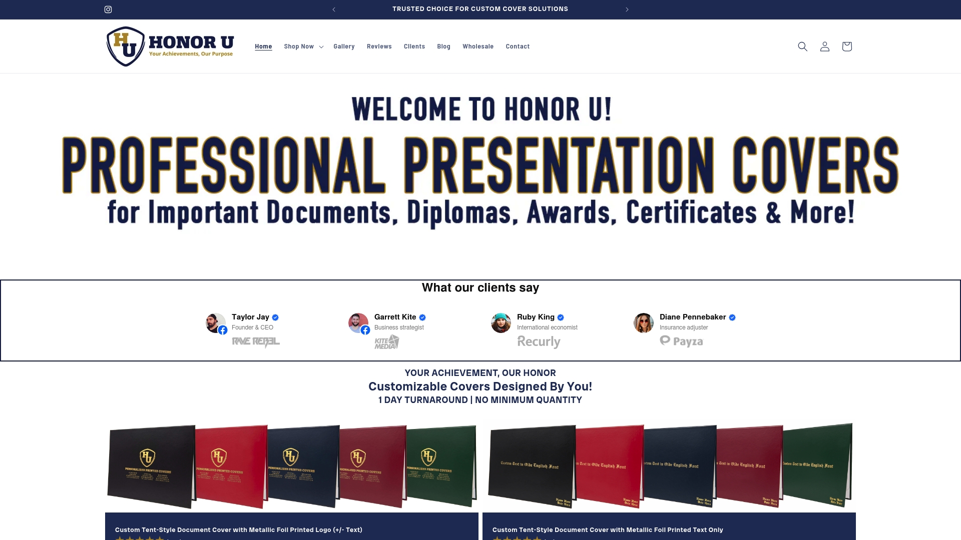
Wehonoru produces tent-style diploma and certificate covers that reflect the leading document cover trends of 2026, including metallic foil printing, custom institutional branding, and made-to-fit sizing for non-standard documents. Every order ships the next business day with no minimum quantity required, making Wehonoru the practical choice for last-minute ceremonies and small-batch recognition programs alike. Whether you need one cover for a single graduate or five hundred for a university commencement, the quality and turnaround time remain consistent.
Explore the Classic Diploma of Graduation cover for a tent-style option that combines premium presentation with durable construction, or browse the Classic High School Diploma cover for a design that honors the milestone with the prestige it deserves.
FAQ
What materials define document cover trends in 2026?
Oxidized metallic finishes, specifically copper patina and pewter silver, are the defining materials for 2026. These finishes offer greater visual depth and perceived prestige than standard bright metallics or generic matte covers.
How do bold typography trends apply to diploma covers?
Bold typography now occupies 55–75% of cover width in leading 2026 designs, using heavy fonts that read clearly at any size. For diploma covers, this means featuring the institution’s name or program title prominently in foil-printed lettering.
What is the most effective way to protect a document in 2026?
The most effective protection combines dynamic viewer-stamped watermarks for digital versions with a high-quality physical cover bearing embossed or foil-printed institutional branding. No single method is sufficient on its own.
When should I choose a tent-style cover over a folder?
Tent-style covers are the preferred format for diplomas and formal credentials because they allow the document to stand upright for display. Folders are better suited for multi-page event programs or presentation packets that recipients will carry and reference.
How do I order custom document covers with no minimum quantity?
Wehonoru accepts orders starting at a single unit with no setup fees, ships the next business day, and offers free shipping on orders over $30. Custom sizing, foil color selection, and logo printing are all available regardless of order size.