Step by Step Custom Document Cover: Full Guide

TL;DR:
- A professional custom document cover features five essential elements: title, subtitle, organization name, date, and logo. Using the right design tools and adhering to print standards like 300 DPI and a 0.125-inch bleed ensures high-quality, print-ready results. Consistent, restrained design and proper print preparation prevent common mistakes, creating elegant, authoritative covers that enhance document presentation.
A custom document cover is defined as a purpose-designed protective and presentational outer page that frames diplomas, certificates, and formal records with professional intent. Following a step by step custom document cover process gives schools, HR departments, and individuals a repeatable method for producing covers that protect important documents and reinforce institutional identity. Tools like Microsoft Word, Canva, and Adobe Photoshop each serve different stages of this process, from initial layout to print-ready file export. This guide covers every phase: design elements, tool selection, digital creation, print preparation, and the most common mistakes that undermine an otherwise strong cover.
What must a professional document cover include?
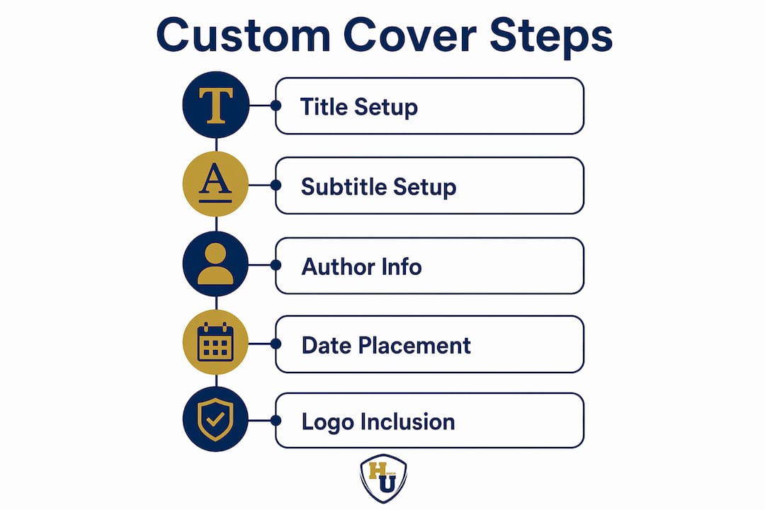
A professional document cover must include five core elements for clarity and impact: a clear title, subtitle, author or organization name, date, and a logo or visual identifier. Each element serves a distinct function in communicating authority and context at a glance.
These five components work together to establish visual hierarchy, which is the order in which a reader’s eye moves across the page. Without hierarchy, even a well-designed cover reads as cluttered and unprofessional.
Here is what each element contributes:
- Title: The primary identifier of the document. Keep it to one line and use the largest type on the page. For diplomas and certificates, this is typically the institution’s name or the award title.
- Subtitle: Provides supporting context, such as “Bachelor of Science in Nursing” or “Certificate of Completion.” One line maximum preserves readability.
- Author or organization name: Identifies the recipient or issuing body. For institutional covers, this is the school, company, or agency name.
- Date: Anchors the document in time. For graduation covers, the ceremony date or academic year is standard.
- Logo or visual identifier: Reinforces branding and authenticity. A university seal, corporate logo, or custom foil emblem adds prestige and makes the cover immediately recognizable.
Matching cover style to audience expectations by genre or document type boosts acceptability and professionalism. A military commendation cover demands formal symmetry and restrained color, while a corporate training certificate can carry bolder branding. Knowing your audience before you open any design software saves significant revision time.
Pro Tip: Lock your title and subtitle text first before placing any graphic elements. Repositioning text after images are placed is the single biggest source of alignment errors in document cover design.
Which tools work best for creating custom covers?
The right tool depends on your output type, skill level, and whether you need a digital file or a print-ready product. Microsoft Word, Canva, Adobe Photoshop, and GIMP each occupy a different position in the custom document cover workflow.
| Tool | Best For | Skill Level | Output Type | Key Limitation |
|---|---|---|---|---|
| Microsoft Word | Digital covers, reports, institutional templates | Beginner | DOCX, PDF | Limited graphic precision |
| Canva | Quick visual design, branded certificates | Beginner to intermediate | PDF, PNG, JPG | Print bleed setup requires paid plan |
| Adobe Photoshop | High-resolution print covers, photo-heavy designs | Intermediate to advanced | PDF Print, PSD | Steep learning curve, subscription cost |
| GIMP | Free alternative to Photoshop | Intermediate | PNG, PDF | Less intuitive interface |
Microsoft Word suits organizations that need to produce consistent digital covers quickly and store reusable templates across departments. Canva excels when visual branding matters and the user lacks formal design training. Adobe Photoshop is the standard for print-ready work where resolution and color accuracy are non-negotiable. GIMP replicates much of Photoshop’s capability at no cost, though the interface requires more patience to learn.
For organizations managing diploma cover design at scale, the most practical approach is to design a master template in Canva or Photoshop, then export it as a PDF for distribution or printing. This separates the creative work from the production work and prevents inconsistencies across batches.
How do you create a custom cover page step by step?
Creating a polished cover page in Microsoft Word or Canva follows a clear sequence. Skipping steps, particularly the layout and typography stages, produces covers that look assembled rather than designed.
Building your cover in microsoft word
- Open a blank document and set your page size to match the document it will cover. For a standard diploma, 8.5 x 11 inches is the default. For non-standard sizes, adjust under Page Layout before adding any content.
- Insert a blank cover page using the Insert menu. Word provides built-in layouts, but selecting “Blank” gives you full control over placement.
- Add text boxes for each of the five core elements: title, subtitle, organization name, date, and logo space. Text boxes allow precise positioning independent of the document’s paragraph flow.
- Apply your typography. Limiting to one display font for titles and one standard font for body information preserves a professional appearance. A common pairing is a serif font like Georgia for the title and a clean sans-serif like Calibri for supporting details.
- Insert your logo or visual identifier. Use Insert > Pictures and position the image within its own text box. Set text wrapping to “In Front of Text” for precise placement.
- Establish visual hierarchy by sizing the title at least 1.5 times larger than the subtitle, and the subtitle larger than the date and organization name.
- Save as a reusable template. Word’s “Save Selection to Cover Page Gallery” function stores your custom layout for use across future documents. This is the single most time-saving feature for institutions producing covers regularly.
Pro Tip: Before saving your Word template, replace all specific text with placeholder labels like [RECIPIENT NAME] and [CEREMONY DATE]. This prevents accidental reuse of a previous recipient’s information.
Building your cover in canva
- Create a new design and set custom dimensions matching your document size.
- Choose a blank canvas rather than a pre-built template. Templates introduce design choices that may conflict with your branding.
- Add a background. A solid color, subtle texture, or institutional color block establishes the visual tone immediately.
- Place text elements using Canva’s text tool. Follow the same five-element structure: title, subtitle, organization name, date, logo.
- Upload your logo using the Uploads panel. Canva accepts PNG files with transparent backgrounds, which prevents white boxes appearing around your logo.
- Apply consistent font pairing across all text elements. Canva’s font library is extensive, but restraint produces better results than variety.
- Export as PDF Print for physical production or PDF Standard for digital distribution.
For organizations that need guidance on custom sizing for document covers, adjusting canvas dimensions in Canva before beginning design prevents the distortion that occurs when you resize a completed layout.
How do you prepare a custom cover for professional printing?
Print preparation is where most self-designed covers fail. A cover that looks sharp on screen can print blurry, color-shifted, or with unprinted white edges if the file is not prepared correctly.
The non-negotiable technical standards for print-ready document covers are:
- Resolution: 300 DPI minimum. Web images at 72 DPI cause pixelation and print rejection. Always source or export images at 300 DPI or higher. When in doubt, use vector graphics (SVG or EPS format) for logos, since they scale without quality loss.
- Bleed margins: 0.125 inch on all sides. Bleed margin of 0.125 inch must be included to accommodate cutting variation. Any background color or image that reaches the edge of the page must extend 0.125 inch beyond the trim line. Failing to add bleed produces white edges after cutting.
- File format: PDF Print. PDF Print format locks layout and image quality, preventing printing distortions. Never submit a DOCX or PNG file to a commercial printer for a cover intended for physical production.
- Color mode: CMYK. Screen design uses RGB color. Commercial printers use CMYK. Converting to CMYK before export prevents unexpected color shifts between your screen preview and the printed output.
- Safe zone: 0.125 inch inside the trim line. Keep all critical text and logos within the safe zone. Elements placed too close to the trim line risk being cut off.
| Print Specification | Required Value | Consequence of Error |
|---|---|---|
| Resolution | 300 DPI minimum | Blurry, pixelated output |
| Bleed margin | 0.125 inch | White edges after cutting |
| File format | PDF Print | Layout distortion |
| Color mode | CMYK | Color shift from screen to print |
| Safe zone | 0.125 inch inside trim | Text or logo cut off |
For book-style or bound document covers, spine width must be precisely calculated based on page count and paper thickness. Guessing spine width leads to layout errors, particularly for thick covers where even a 1mm miscalculation causes the spine text to wrap onto the front or back panel. Use a dedicated spine width calculator, such as those provided by commercial print services, before finalizing your canvas dimensions.
Pro Tip: Export a low-resolution proof PDF first and view it at 100% zoom on screen. If any element looks soft or pixelated at that zoom level, the source image resolution is too low for print.
What are the most common custom cover design mistakes?
Design errors in custom document covers fall into two categories: visual mistakes that undermine professionalism, and technical mistakes that cause print failures. Both are preventable with a structured review process.
Visual mistakes to avoid:
- Font overuse. Using three or more typefaces on a single cover creates visual noise. Avoiding multiple fonts prevents clutter and an amateur look in document covers. Limit yourself to two fonts maximum.
- Cluttered layouts. Adding decorative borders, multiple background images, or excessive text blocks competes with the core information. A strong cover page starts with structure, not decoration, emphasizing clarity and professional credibility over flashy design.
- Poor alignment. Elements that are not aligned to a consistent grid or center axis read as careless. Use your design tool’s alignment guides to snap every element to a consistent reference point.
- Inconsistent branding. Covers produced across a department or institution should use the same logo version, color values, and font choices. Inconsistency signals a lack of organizational attention to detail.
Technical mistakes to avoid:
- Ignoring bleed requirements. Backgrounds must extend beyond trim lines to avoid white edges on print covers. This is the most frequently cited print rejection reason.
- Using low-resolution images. Sourcing images from websites or screenshots produces 72 DPI files that print poorly. Always request high-resolution assets from your branding team or use vector formats.
- Skipping a digital proof. Before sending any cover to print, export a PDF and review it on a calibrated monitor. Check alignment, font rendering, and color accuracy before committing to a print run.
- Forgetting to embed fonts. When exporting from Word or Canva to PDF, confirm that fonts are embedded in the file. Missing fonts cause text to reflow or substitute with system defaults at the printer’s end.
For organizations managing recognition document covers across multiple departments, a shared design checklist distributed before each print run eliminates the majority of these errors before they reach production.
Key takeaways
A professional custom document cover requires five core design elements, the right tool for your output type, and print-ready file specifications that meet 300 DPI and 0.125-inch bleed standards.
| Point | Details |
|---|---|
| Five core elements are mandatory | Every cover needs a title, subtitle, organization name, date, and logo for professional clarity. |
| Tool choice determines output quality | Use Microsoft Word for digital templates, Canva for branded visuals, and Photoshop for print-ready files. |
| 300 DPI and bleed margins are non-negotiable | Print files below 300 DPI or without 0.125-inch bleed will produce rejected or low-quality output. |
| Save reusable templates | Storing custom layouts in Word’s Cover Page Gallery or Canva saves time and enforces branding consistency. |
| Limit fonts to two per cover | One display font for titles and one standard font for body text prevents a cluttered, unprofessional appearance. |
What experience teaches about custom document covers
Working with document covers across educational institutions, corporate HR teams, and government agencies reveals a consistent pattern: the covers that hold up over time are the ones built on restraint, not ambition.
The most common mistake I see is treating the cover as a design showcase. A diploma cover is not a poster. Its job is to frame the document inside with dignity, not to compete with it. The institutions whose covers I respect most use one color, one font family, and one well-placed logo. That discipline communicates confidence. Overdesigned covers communicate anxiety.
The second lesson is about templates. Organizations that invest thirty minutes building a proper reusable template in Microsoft Word or Canva save hours across every subsequent production run. The template is not a shortcut. It is the standard. Every cover produced from it carries the same alignment, the same font sizes, and the same color values. That consistency is what creates an heirloom feel across an institution’s documents over years and decades.
The third lesson is about print preparation. I have seen beautifully designed covers ruined at the printer because the designer did not know what bleed margins were. The design work and the print preparation work require equal attention. A cover that looks perfect on screen and prints with white edges has failed its purpose entirely.
My practical advice: design for the document inside, not for the designer’s portfolio. Choose clarity over complexity. Build your template once and protect it. And always, always prepare your print files to specification before sending them anywhere near a press.
— Manager
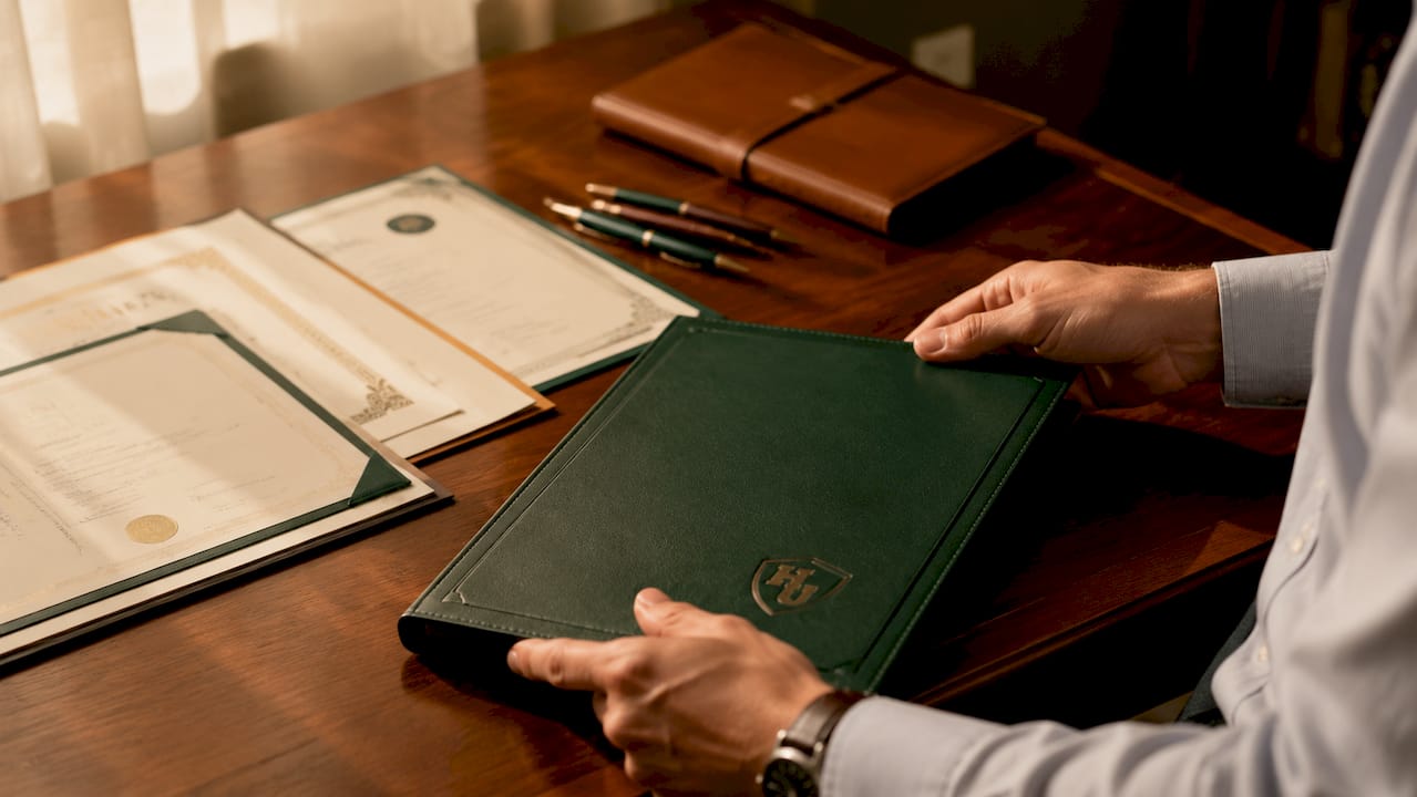
Ready-made covers that honor every achievement
Designing a custom cover from scratch takes time and technical knowledge. For schools, HR teams, and individuals who need a polished result without the production overhead, Wehonoru offers a direct solution.
Wehonoru’s tent-style diploma and certificate covers are produced with metallic foil printing, premium materials, and a 1-business-day turnaround. There are no minimum order quantities and no setup fees, making them accessible for a single graduation or a class of five hundred. The Classic Diploma of Graduation cover and the Class of graduation cover are available with full customization options, including institutional logos, custom text, and multiple foil colors. Free shipping applies to orders over $30.
FAQ
What are the five elements every document cover needs?
A professional document cover must include a clear title, subtitle, author or organization name, date, and a logo or visual identifier. Each element should follow a clear visual hierarchy, with the title as the largest element on the page.
What file format should i use for a print-ready cover?
PDF Print is the required format for print-ready custom covers. This format locks layout and image quality, preventing distortions that occur with DOCX or standard PDF exports.
How do i avoid white edges on my printed cover?
Add a 0.125-inch bleed margin on all sides of your design, extending any background color or image beyond the trim line. Covers without bleed produce unprinted white edges after the cutting process.
Can i save a custom cover page for reuse in microsoft word?
Yes. Word’s “Save Selection to Cover Page Gallery” function stores your custom layout for use across future documents. This feature is found under the Insert menu after selecting your cover page content.
What is the minimum image resolution for a printed document cover?
Print quality requires a minimum of 300 DPI. Images sourced from websites are typically 72 DPI and will print blurry or be rejected by commercial print services. Use vector formats for logos whenever possible.
Recommended
- Your Vision, Our Craft: A Deep Dive into Designing Your Custom Document Cover | Honor U
- The Perfect Fit: Understanding Document Cover Sizes & Why Yours Might Be Unique | Honor U
- Custom Sizing for Document Covers: A Complete Guide | Honor U
- How to Design a Certificate Cover: Step-by-Step Guide | Honor U