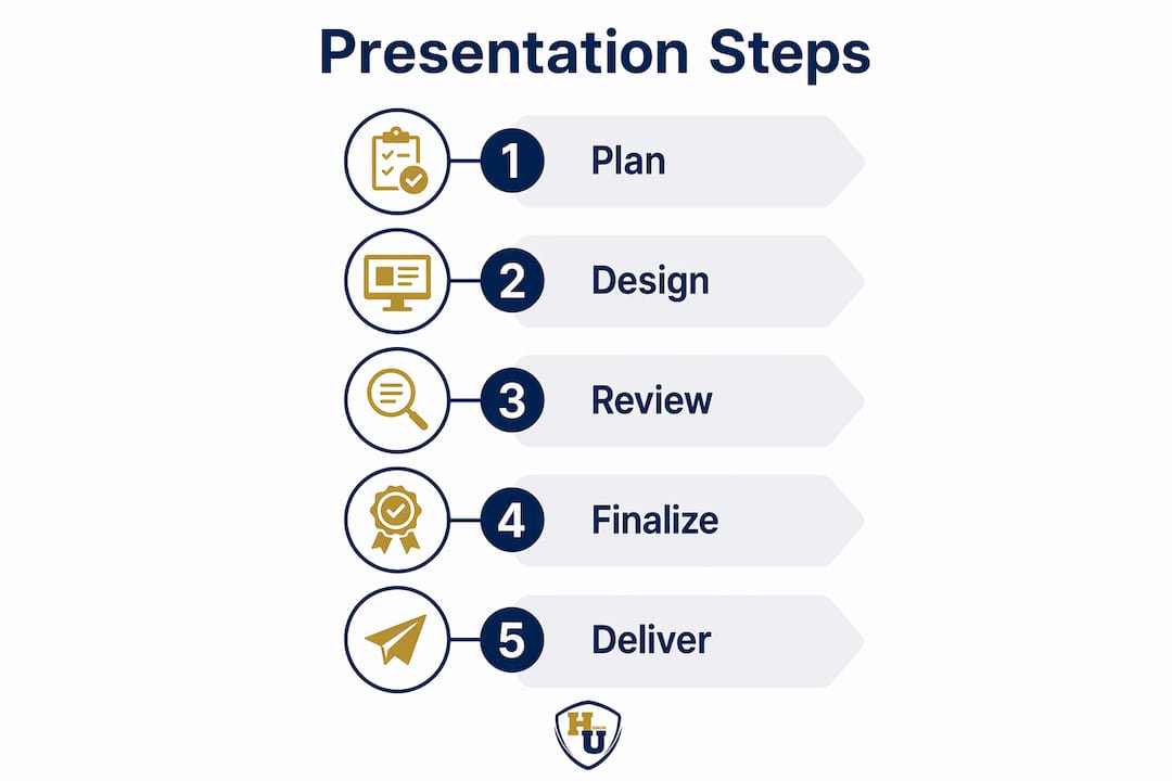
Professional Document Presentation: A Complete 2026 Guide

TL;DR:
- Professional document presentation communicates respect through disciplined design, accessibility, and quality standards. Using consistent typography, restrained color palettes, alignment, and physical covers enhances clarity and credibility in professional materials. Implementing template workflows, preflight checks, and physical framing elevates both digital and printed documents, fostering trust and professionalism everywhere.
When a diploma, proposal, or certification crosses a decision-maker’s desk, the quality of its professional document presentation communicates something before a single word is read. Most professionals focus heavily on content and overlook the structural, visual, and production decisions that determine whether a document commands respect or gets shuffled aside. The essentials of professional document presentation go well beyond decorative choices. They include design discipline, accessibility standards, tool selection, print specifications, and the physical covers and folders that frame the document itself. This guide covers all of it, with the specificity and practical depth that generic advice never provides.
Key Takeaways
| Point | Details |
|---|---|
| Design for clarity, not decoration | One clear message per page or slide increases audience comprehension and retention significantly. |
| Use the right tools with templates | Branded templates in PowerPoint, Google Slides, or Adobe Acrobat reduce rework and protect visual identity. |
| Accessibility is non-negotiable | WCAG AA contrast ratios and adequate font sizing improve usability for every reader, not just those with disabilities. |
| Preflight before you print | Print-ready PDFs require 300 DPI images, embedded fonts, and PDF/X compliance to avoid costly production errors. |
| Physical presentation matters | Premium document covers and certificate holders are the final layer of professional credibility that digital files cannot replace. |
Foundational design principles for professional documents
The most persistent misconception in business document design is that professionalism is a visual quality, something you achieve by adding more polish, more colors, or more graphic elements. In practice, the opposite is true. Professional slide design prioritizes one main takeaway per slide or page, limiting fonts to no more than two, keeping body text at a readable 18 to 24 point size, and maintaining consistent margins throughout. These constraints feel restrictive until you see how much clarity they create.
Typography hierarchy is the structural backbone of any effective layout. Your primary font handles headlines and carries the document’s tone. A secondary font handles body text and captions. Mixing more than two typefaces creates visual competition that fatigues readers and signals a lack of design discipline. Stick with combinations that contrast in weight rather than style: a bold sans-serif headline paired with a legible serif body, for example, works across both digital and print contexts.
Color restraint is equally decisive. A professional color palette typically consists of:
- A primary brand color used for headlines, key accents, and borders
- Neutral tones (white, light gray, or warm cream) for backgrounds and large text areas
- One accent color reserved exclusively for calls to action, data highlights, or critical callouts
Introducing a fourth color without a clear purpose almost always reduces perceived professionalism. Restraint signals confidence.
Alignment and grid structure do the invisible work of making a document feel authoritative. Every text block, image, and chart should snap to a consistent grid, whether you are designing a proposal, a report, or a slide deck. Readers do not consciously notice alignment, but they notice misalignment. It introduces a subtle sense of disorder that undermines trust in the content itself.

Visual consistency across icons and photos deserves particular attention. Mixing icon styles such as combining filled icons with outline icons, or pairing cold-tone photography with warm-tone illustrations, distracts viewers and fragments the document’s visual identity. Commit to one visual style and apply it uniformly.
Pro Tip: Build a one-page visual standards reference for every document project: approved fonts, hex color codes, icon style, and photo tone. Share it with every contributor before work begins. This single step eliminates most design inconsistency before it starts.
Tools and workflows that support polished output
Selecting the right software is not about brand loyalty. It is about matching the tool’s capabilities to your document’s complexity, audience, and distribution method. Three platforms dominate professional workflows in 2026, and each has a distinct role.
-
Microsoft PowerPoint remains the standard for formal slide-based presentations in corporate, government, and healthcare contexts. PowerPoint’s AI features now include real-time collaboration, automatic slide structure suggestions, and export options covering PPTX, PDF, and image formats. For teams working within Microsoft 365 environments, it offers the deepest integration with approval workflows and shared file systems.
-
Google Slides excels in cross-platform collaboration where multiple contributors need simultaneous access without version conflicts. Its browser-based model eliminates the “wrong version” problem that plagues emailed file attachments. The tradeoff is reduced control over typography and print-ready output compared to desktop applications.
-
Adobe Acrobat has expanded significantly beyond PDF management. Its 2026 AI-assisted workflow allows users to upload existing documents, generate presentation outlines, apply templates, edit slides, and export to PDF, PNG, JPG, or PPTX. For teams converting reports or proposals into presentations, this capability reduces production time substantially.
-
Reusable branded templates are the single highest-return investment any organization can make in its document production process. A well-constructed master template embeds fonts, color palettes, logo placement, and slide grid structure at the template level. Contributors work within those parameters without needing to recreate them. This is not a convenience feature. It is a quality control mechanism.
-
Version control and export discipline close the loop. Establish a clear file naming convention (ProjectName_Version_Date), maintain a single source-of-truth folder, and always export final deliverables to PDF rather than sharing editable source files with external audiences.
Pro Tip: When you finalize a branded template, lock the master slide elements so contributors cannot accidentally move logos, alter color schemes, or change font assignments. In PowerPoint, this is controlled through the Slide Master view. In Google Slides, it requires setting restrictions in the sharing settings combined with grouped and protected elements.
For teams exploring online design tools that incorporate design intelligence, understanding how layout automation works in your chosen platform will help you get consistent results faster.
Accessibility and readability standards
Accessibility in document design is often treated as a compliance obligation that applies to a narrow audience. That framing is both inaccurate and strategically shortsighted. Accessible visual design enhances usability for every reader, including those viewing documents on low-quality screens, in poor lighting, or under time pressure. Designing for accessibility is designing for clarity.
The WCAG AA standard provides the most practical framework for document designers:
- Normal text requires a contrast ratio of at least 4.5:1 against its background. This means dark gray or black text on white or near-white backgrounds, not medium gray on light gray.
- Large text (18 point or larger, or 14 point bold) requires a minimum 3:1 contrast ratio. Headers set in brand colors must meet this threshold.
- Line spacing set to a line-height of 1.5 to 2 significantly improves readability for body text, particularly in print and PDF formats where screen zoom is not available.
- Font size for body text in printed documents should not fall below 11 point. For presentation slides intended to be viewed at a distance, 18 point is the practical minimum.
- Icons and visuals must be used consistently and, where they carry meaning, accompanied by text labels. An icon that a designer finds self-evident may communicate nothing to a reader from a different professional background.
Two accessibility pitfalls appear with high frequency in otherwise polished documents. The first is low-contrast decorative text, where a headline set in a light brand color against a white background fails contrast requirements despite looking elegant on the designer’s calibrated monitor. The second is relying solely on color to convey information, such as using red and green in a chart without a secondary indicator like texture or labeling. Both errors are simple to fix once you know to look for them.
The education and HR document guide from Wehonoru provides additional context on how accessibility considerations translate into physical document presentation, particularly for certification materials that need to be readable in varied institutional settings.
Preparing final outputs for print and digital delivery
The gap between a document that looks professional on screen and one that prints correctly is wider than most professionals expect. Print-ready PDFs require a specific set of technical parameters that differ meaningfully from screen-optimized files.
| Specification | Print-Ready Standard | Screen/Digital Standard |
|---|---|---|
| Image resolution | 300 DPI minimum | 72 to 96 DPI |
| Color mode | CMYK | RGB |
| Bleed | 3 mm on all sides | Not required |
| Font handling | Embedded (PDF/X-4 compliance) | System fonts acceptable |
| File standard | PDF/X-4 or PDF/X-1a | Standard PDF |
| Margin (safe zone) | 5 mm inside bleed | Standard margin |
A preflight check, run before sending any file to print, catches the errors that cause the most expensive reprints. Preflight checks verify that fonts are embedded, images meet resolution requirements, color profiles are consistent, and no elements extend outside the live area. Most professional PDF software includes automated preflight profiles. Use them without exception.
For digital slide decks shared externally, always export to PDF rather than sharing the editable source file. This preserves your font rendering, layout integrity, and design intent regardless of what software the recipient uses. If the presentation includes animation or embedded video, a supplementary PPTX or MP4 export may accompany the PDF.
File naming and version control deserve the same rigor as design quality. A proposal submission checklist should include verification that the correct file version is attached, placeholder text has been removed, the file name reflects the project and date, and format requirements match the recipient’s specifications. These details appear minor. Submitting the wrong version of a proposal or a document with “INSERT CLIENT NAME HERE” still visible is a credibility failure that no design quality can recover.
Pro Tip: Create a two-step final review process: one pass for content accuracy, one pass specifically for technical specifications. Most errors slip through because reviewers check content and assume the file settings are correct. Separating these tasks catches both categories of error reliably.
Team collaboration for brand-consistent document output
Organizations that produce documents at scale face a specific challenge: maintaining visual identity and quality standards across contributors who have varying levels of design experience. The answer is not to centralize all document production with a design team. That creates bottlenecks. The answer is to engineer the system so that contributors cannot easily deviate from standards.
Branded master templates are the foundation of this approach. Template-driven workflows that embed brand colors, approved fonts, logo placement, and slide layout patterns at the template level mean that even contributors with minimal design experience produce on-brand output. Amazon’s internal workflows use this principle to transform document creation from hours into minutes while maintaining visual consistency across teams.
Effective team collaboration for document production includes several interconnected practices:
- Role clarity: Designate a document owner responsible for final approval on each project. Without a single owner, conflicting feedback from multiple stakeholders accumulates without resolution.
- Review stages: Build a structured review cycle with at least two stages. The first review addresses content accuracy and messaging. The second addresses design compliance and technical specifications. Conflating these stages slows both.
- Feedback protocols: Use tracked changes or comment tools within your chosen platform rather than emailing annotated screenshots or verbal feedback. A documented change history prevents re-introduction of previously rejected revisions.
- Template governance: Assign one person or team as the custodian of master templates. When brand guidelines update, templates are updated centrally and distributed, rather than leaving teams working from outdated local copies.
- Flexibility boundaries: Define which elements contributors may customize (text, data, charts) and which are fixed (logo position, brand colors, footer content). Communicating these boundaries explicitly prevents the gradual drift that erodes visual identity over time.
The custom document cover design guide from Wehonoru illustrates how these principles translate into physical document production, where brand consistency must carry through from the digital file to the printed cover.
My perspective on what truly elevates document presentation
I’ve reviewed hundreds of presentations from organizations across education, healthcare, and corporate environments, and the pattern is consistent. The documents that command the most respect are almost never the most visually elaborate ones. They are the most disciplined ones.
What I’ve found is that the professionals who invest in beautiful design without first resolving their core message produce materials that look impressive in a thumbnail and confuse in the reading. Simplicity is not a design limitation. It is the hardest design achievement there is.
Template-driven workflows changed how I think about quality at scale. When I worked with institutional teams that had adopted locked master templates, their average document quality was consistently higher than teams with more design freedom. The constraint created coherence. Freedom, without structure, created chaos.
Accessibility is where I see the most strategic opportunity being left on the table. Teams that treat it as a compliance checkbox produce documents that technically pass contrast tools but still feel difficult to read. Teams that treat it as a clarity goal produce materials that every reader, in every condition, can engage with confidently. The difference in audience reception is measurable and real.
The physical presentation layer is where digital-first teams most often drop the ball. A perfectly formatted PDF delivered in a premium, well-fitted document cover communicates something that the digital file alone cannot. The moment someone holds a document in a quality cover, they perceive the content differently. That perception is not superficial. It reflects the genuine care the presenter invested in the work.
Iterate. Test your documents with actual readers before final distribution. The feedback you receive from a non-specialist reader in five minutes will identify clarity problems that three internal reviewers missed entirely.
— Manager
Bring your documents to life with Wehonoru
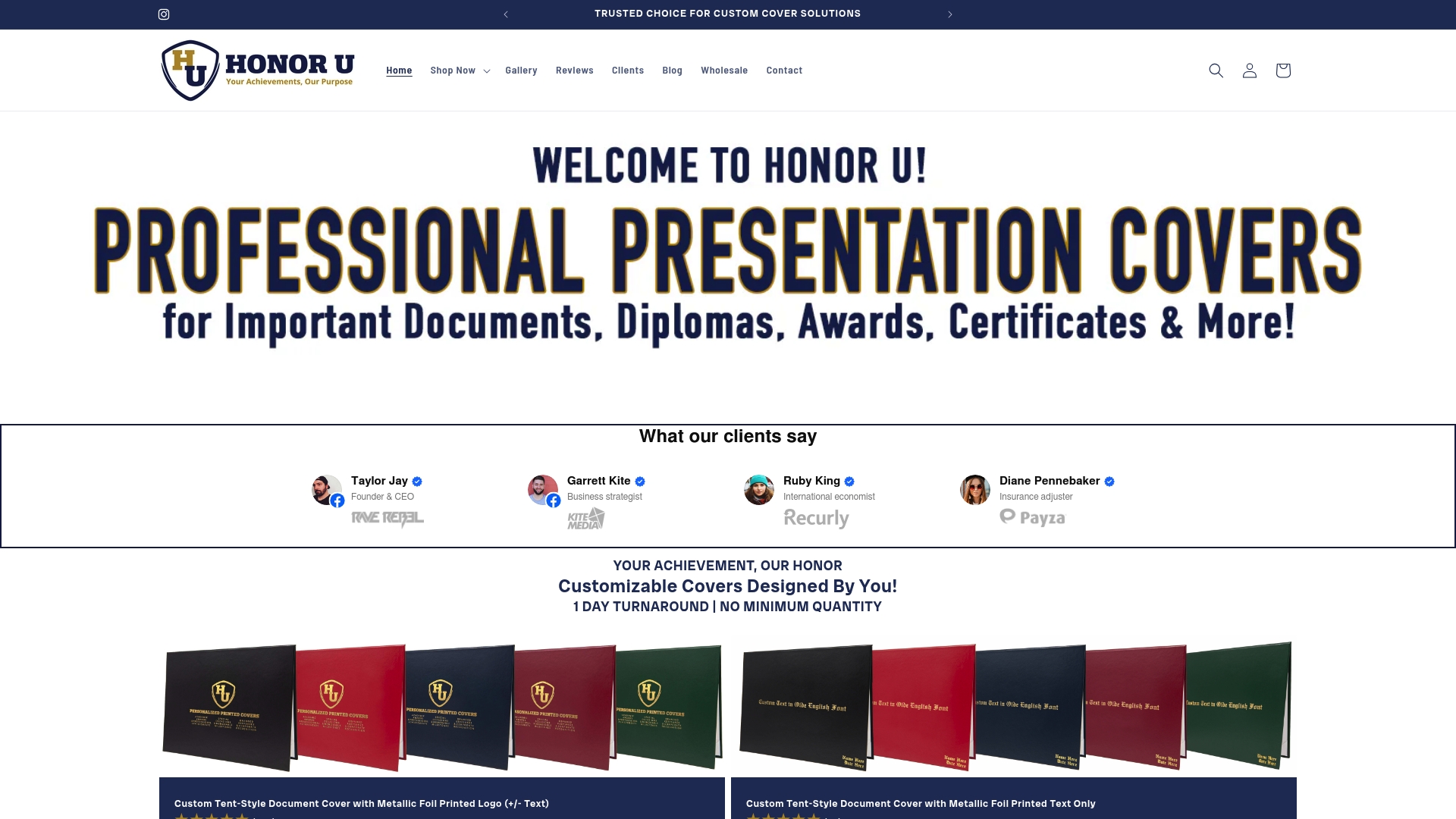
A polished digital file is only part of a complete professional presentation. The physical cover that frames a diploma, certificate, or award is the first thing a recipient touches, and it carries the full weight of the moment. Wehonoru specializes in exactly this final layer of professional credibility.
The Classic Diploma of Graduation cover from Wehonoru is a tent-style document cover built for ceremonial presentation: durable materials, a refined finish, and a design that honors the significance of the document inside. For high school ceremonies specifically, the Classic High School Diploma cover offers the same quality in a format tailored to traditional diploma dimensions.
For organizations that need custom branding, the Custom Tent-Style Cover with metallic foil allows institutions to print logos, names, and text in premium metallic foil, with no minimum order quantities and a one-business-day production turnaround. Whether you need one cover or one thousand, Wehonoru delivers without the wait or the setup fees that other suppliers require.
FAQ
What are the core elements of professional document presentation?
Professional document presentation combines clear visual design, consistent typography, accessible color contrast, and print-ready technical specifications, along with the physical covers or folders that frame the final document for its recipient.
How many fonts should a professional document use?
Professional slide and document design recommends no more than two fonts: one for headlines and one for body text. Using more than two typefaces creates visual competition that reduces perceived quality.
What contrast ratio is required for accessible document text?
WCAG AA standards require a minimum contrast ratio of 4.5:1 for normal body text and 3:1 for large text (18 point or larger) against its background color.
What specifications does a print-ready PDF require?
A print-ready PDF requires a minimum image resolution of 300 DPI, embedded fonts, CMYK color mode, a 3 mm bleed on all sides, and compliance with the PDF/X-4 standard to avoid errors during professional printing.
Why do branded templates improve team document quality?
Template-driven workflows embed approved colors, fonts, and layout structures at the template level, preventing contributors from accidentally deviating from brand standards and reducing the time spent correcting design inconsistencies after the fact.
Recommended
- More Than Just a Folder: Level Up Your Presentation Game | Honor U
- Your Vision, Our Craft: A Deep Dive into Designing Your Custom Document Cover | Honor U
- From Diploma to Dream: A Graduate’s Guide to Thriving in 2025 | Honor U
- The Perfect Fit: Understanding Document Cover Sizes & Why Yours Might Be Unique | Honor U