
Presentation Folder Ideas That Strengthen Your Brand

TL;DR:
- Presentation folders are designed to organize documents professionally and reflect brand identity. The standard size is 9x12 inches, suitable for letter-size documents, with various styles like two-pocket, mini, and tent-style for different uses. Customization with quality finishes, strategic design, and proper organization enhances their effectiveness as a communication tool.
Presentation folder ideas are concepts and strategies for designing folders that organize documents professionally while reflecting and enhancing your brand identity. The industry term for these products is “pocket folders” or “document presentation folders,” and they serve a dual purpose: protecting physical materials and communicating brand quality before a single page is read. The most common format is 9x12 inches, sized to hold letter-size documents without folding. Whether you represent a school, a corporation, a healthcare organization, or a nonprofit, the folder you hand someone is the first physical impression of your institution. Getting that impression right requires deliberate choices about format, finish, and content organization.
1. What are the top presentation folder styles and designs to consider?
The 9x12 pocket folder is the standard starting point for most business and institutional uses. It fits letter-size documents flat, accepts a wide range of inserts, and works across industries from corporate sales to academic ceremonies. That versatility makes it the default choice for first-time buyers and experienced procurement teams alike.
Beyond the standard format, several specialized styles serve distinct purposes:
- Mini folders and brochure folders: Compact formats, typically 4x9 or 6x9 inches, work well for trade show handouts, product brochures, or retail displays where a full-size folder would feel excessive.
- Two-pocket folders: The most widely used configuration for business presentations. Each pocket typically holds a substantial stack of documents, and most designs include die-cut slits for business cards.
- Single-pocket folders: Cleaner and lighter, suited for simple proposals or welcome packets where fewer inserts are needed.
- Multi-panel and expandable folders: Designed for larger document sets such as legal contracts, training manuals, or conference materials. Expandable spines allow the folder to hold thicker stacks without warping or failing to close.
- Tent-style and certificate covers: A distinct category used for diplomas, certificates, and formal recognition documents. These fold open like a book and display the document upright, making them ideal for graduation ceremonies and award presentations.
Visual styles vary just as much as physical formats. Minimalist designs with a single logo and clean white or neutral stock project quiet authority. Bold branding with full-bleed color, large typography, and strong imagery works well for creative agencies, marketing firms, and consumer-facing brands. Die-cuts, where the cover is shaped or cut to reveal an interior element, add a tactile dimension that generic folders cannot replicate.
Pro Tip: When choosing a visual style, match it to the context of delivery. A folder handed to a hospital administrator calls for restrained, professional design. A folder presented at a design conference can afford more visual risk.
2. How to creatively customize presentation folders to reinforce brand and usability
Effective customization starts with the front cover. Design guides recommend using the front cover for one main message only. A logo, a tagline, or a single strong image. Crowding the cover with multiple messages dilutes impact and signals poor editorial judgment to the recipient.
The interior panels deserve equal attention. Keep them clean and scannable. Use the left pocket for supporting materials such as brochures or case studies, and the right pocket for primary documents such as proposals or contracts. Place contact information where it is immediately visible, typically on the inside right panel or on a business card in the die-cut slit.
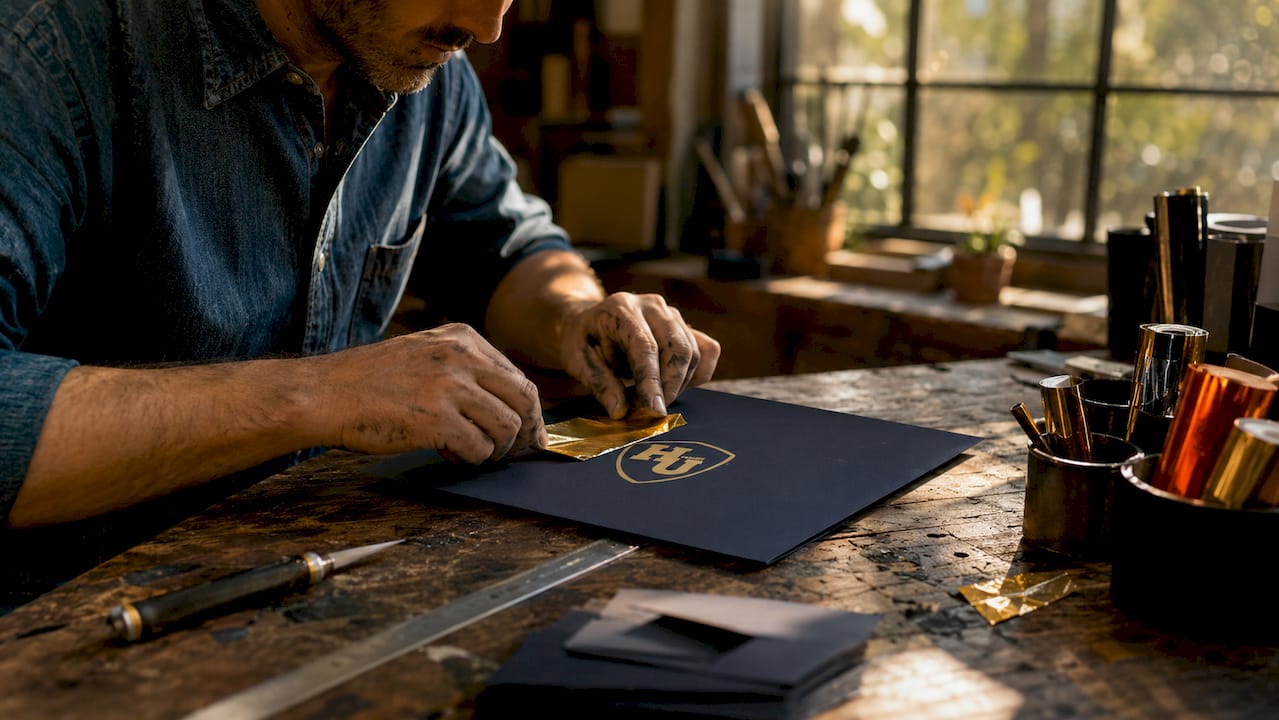
Tactile finishes are where folders move from functional to memorable. Soft-touch coatings, spot UV, foil stamping, and embossing each affect how a folder feels in the hand and how it reads visually. Soft-touch matte creates a velvety surface that feels premium without being flashy. Spot UV adds a glossy accent layer over specific design elements, making logos or headlines pop against a matte background. Foil stamping, particularly in gold, silver, or copper, signals prestige and is widely used for academic, legal, and luxury applications.
Paper stock matters as much as finish. Matching the folder’s stock and finish to your other printed materials, such as letterhead, business cards, and brochures, creates a cohesive brand identity. A folder printed on 100 lb. cover stock with a matte laminate finish should pair with business cards on similar stock, not with flimsy offset-printed cards.
Key customization decisions to make before placing an order:
- Logo placement and size: The logo should anchor the cover without overwhelming it.
- Color palette: Limit the folder to two or three brand colors for a disciplined, professional result.
- Pocket configuration: Choose based on the specific inserts you plan to include, not based on what looks most impressive in a catalog.
- Finish type: Matte for understated authority, gloss for vibrancy, soft-touch for tactile quality, foil for prestige.
- Paper weight: Heavier stock signals quality. Standard folders use 80–100 lb. cover stock.
Pro Tip: When submitting artwork to a printer, include the interior pocket graphics in your production file. Pocket interior art must be part of the file because pockets are folded and glued after printing. Missing this step is one of the most common and costly production errors.
3. What are practical ideas for organizing and protecting documents inside presentation folders?
The physical structure of a folder directly shapes how recipients engage with its contents. Pocket design, panel breaks, and die-cuts affect not just aesthetics but the sequence in which information is encountered. A well-organized folder guides the reader through your message without requiring them to sort through a stack of loose papers.
Practical organization follows a clear logic:
- Use the right pocket for the primary document. Recipients naturally open a folder and look right first. Place your most important document, whether a proposal, a certificate, or a contract, in the right pocket.
- Use the left pocket for context and support. Brochures, case studies, reference sheets, and supplementary materials belong on the left. This keeps the primary message clean and accessible.
- Use die-cut business card slits. Two-pocket folders with die-cut slits hold business cards securely and prevent them from sliding loose inside the pocket. This is a small detail that consistently improves the recipient’s experience.
- Avoid overstuffing. Each pocket has a practical capacity limit. Overfilling causes the folder to bulge, fail to close cleanly, and project a disorganized impression. If your insert set is large, choose an expandable folder rather than forcing materials into a standard pocket.
- Match folder size to document size. A 9x12 folder fits standard letter-size documents. For legal-size documents, use a 9.5x14.5 folder. For diplomas and certificates that fall outside standard dimensions, custom-sized covers are the correct solution.
- Sequence inserts intentionally. Arrange materials in the order you want them read. If you are presenting a sales proposal, lead with the executive summary, follow with pricing, and close with testimonials or case studies.
- Protect fragile or formal documents. Certificates, diplomas, and legal documents benefit from folders with reinforced pockets or rigid covers. A tent-style cover with a firm spine protects the document during transport and displays it upright during presentation.
The choice and placement of pockets, die-cuts, and business card slits affect long-term usability and document protection, not just the initial impression. A folder that holds up after being carried in a bag or stored in a file cabinet reflects well on the organization that produced it.
4. How to choose presentation folder designs for different professional contexts and events
The right folder design depends on the context of delivery, the audience receiving it, and the purpose the folder serves after the meeting ends. A folder for a corporate sales pitch has different requirements than one for a university graduation ceremony.
| Context | Recommended Style | Key Features |
|---|---|---|
| Corporate sales and executive presentations | Minimalist, premium finish | Soft-touch matte, foil logo, heavy stock |
| Creative agencies and marketing firms | Bold, full-bleed design | Spot UV, die-cuts, strong imagery |
| Trade shows and conferences | Durable, take-home friendly | Expandable pockets, clear branding, lightweight stock |
| Education and academic ceremonies | Formal, heirloom quality | Tent-style cover, foil stamping, rigid construction |
| HR and employee recognition | Clean, institutional branding | Two-pocket, business card slit, consistent color palette |
| Healthcare and compliance | Professional, understated | Matte finish, minimal design, durable stock |
| Nonprofit and community organizations | Warm, accessible design | Budget-friendly stock, clear messaging, moderate finish |
Corporate and executive contexts demand restraint. A folder with a clean logo, a single accent color, and a soft-touch finish communicates authority without overstatement. Creative industries can push further, using die-cuts, textured stock, or unexpected color combinations to signal originality.
Trade shows require folders that survive being carried in a bag for hours. Heavier stock and reinforced pockets prevent wear. The design should communicate the brand clearly at a glance, since recipients may not open the folder until days later.
Education and HR applications benefit from folders that reinforce institutional identity through consistent logos, colors, and formal finishes. For graduation ceremonies and award presentations, tent-style covers with metallic foil printing create an heirloom quality that recipients keep long after the event.
Designing evergreen folder systems with consistent branding and general messaging allows organizations to update inserts without reordering folders for every event. Avoid printing event-specific dates or program names directly on the folder cover. That single decision extends the useful life of your folder inventory and reduces long-term costs significantly.
5. What makes a presentation folder reflect strong brand identity?
High perceived professionalism derives from the combination of logos and colors, paper thickness, finish quality, and how the folder guides recipients through a content sequence. No single element carries the full weight. The folder works as a system.
Brand identity in a folder starts with consistency. The colors, fonts, and logo treatment on the folder must match your other printed and digital materials exactly. A folder that uses a slightly different shade of blue than your website or letterhead signals inconsistency, and recipients notice even when they cannot articulate why.
Clean logos, minimal cover text, and quality paper stock are the three non-negotiable elements of a professional impression. Everything else, finish type, pocket configuration, die-cuts, is secondary to getting these three right. A folder with a crisp logo on heavy stock will always outperform a folder with elaborate design on thin, flimsy paper.
The folder also functions as a physical representation of your organization’s values. A school that presents diplomas in a well-constructed, foil-stamped cover communicates that it takes its graduates’ achievements seriously. A law firm that delivers contracts in a premium folder communicates attention to detail. These signals are subtle but consistent, and they accumulate over time into brand reputation.
Avoid adding unnecessary structural complexity to a folder design. Features like multiple expandable pockets, elaborate die-cuts, and specialty closures increase production costs and can make the folder harder to use. Add a feature only when it solves a real organizational problem. If your standard insert set fits comfortably in a two-pocket folder, there is no reason to order an expandable version.
Key Takeaways
The most effective presentation folder ideas combine a focused cover design, deliberate pocket organization, and finish choices that match the brand’s broader identity.
| Point | Details |
|---|---|
| Start with the right format | A 9x12 two-pocket folder fits most business and institutional uses without modification. |
| Use the cover for one message | A single logo, tagline, or image on the cover creates stronger impact than a crowded layout. |
| Match finish to brand materials | Consistent stock and finish across folders, cards, and letterhead builds cohesive brand identity. |
| Organize inserts intentionally | Place primary documents on the right and supporting materials on the left for natural reading flow. |
| Design for longevity | Avoid event-specific details on the folder itself so inserts can be updated without reordering. |
What I’ve learned from years of watching folders get it wrong
The most common mistake organizations make with presentation folders is treating them as an afterthought. The document gets all the attention. The folder gets ordered in a rush, often from a generic template, and it arrives looking like it belongs to a different organization entirely.
The second most common mistake is overbuilding. I have seen folders with four pockets, a CD sleeve, a USB holder, and a pen loop. None of those features were used. The folder was too thick to close and too heavy to carry comfortably. Every added feature that does not solve a real problem is a cost that reduces the budget available for the things that actually matter, like paper weight and finish quality.
The insight that changes how most organizations approach this is simple: the folder is not a container. It is a communication tool. Its physical qualities, how it feels, how it opens, how it holds its shape, communicate something about the organization before a single word is read. A well-designed presentation folder that uses quality stock and a restrained design will consistently outperform an elaborate folder on cheap paper.
My practical advice: order a sample before committing to a large quantity. Feel the paper. Open and close the pockets. Put your actual inserts inside and see whether the folder closes cleanly. That five-minute test will save you from a costly mistake more reliably than any design review.
, Manager
Wehonoru’s custom document covers for every presentation need
Organizations that need presentation-quality document covers without long lead times or large minimum orders have a direct option in Wehonoru. The company produces custom diploma covers, certificate holders, and tent-style document covers with metallic foil printing, shipping orders in one business day with no minimum order quantity.
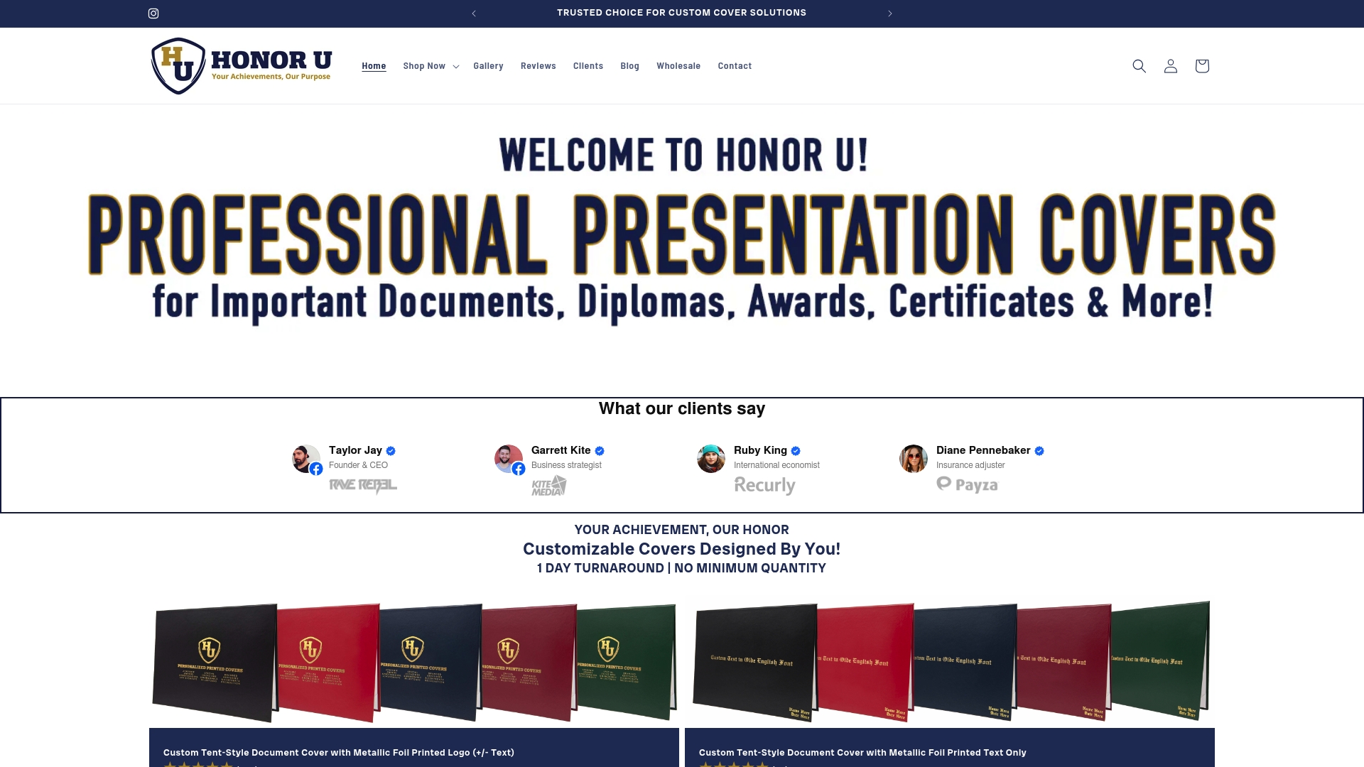
Wehonoru’s classic graduation document cover is built for formal presentations, with a rigid tent-style construction and foil-stamped customization that creates an heirloom quality finish. For class-specific events, the class-year graduation cover allows institutions to personalize by year with no setup fees. Free shipping applies to orders over $35, and bulk pricing discounts apply automatically at checkout.
FAQ
What is the standard size for a presentation folder?
The standard presentation folder size is 9x12 inches, designed to hold letter-size documents without folding. Legal-size documents require a larger format, typically 9.5x14.5 inches.
How many documents can a two-pocket folder hold?
A standard two-pocket folder holds up to 50 sheets per pocket, giving a combined capacity of up to 100 sheets. Overfilling beyond that capacity causes the folder to bulge and fail to close cleanly.
What finish is best for a professional presentation folder?
Soft-touch matte laminate is the most widely used finish for corporate and institutional folders because it feels premium and resists fingerprints. Foil stamping is the preferred choice for formal or ceremonial applications such as diplomas and awards.
Should I print event-specific details on my presentation folder?
Printing event-specific dates or program names on the folder itself limits its useful life to a single event. Designing the folder with general branding and updating inserts for each event extends the folder’s usability and reduces long-term printing costs.
What is a tent-style document cover used for?
A tent-style document cover is a rigid folded cover designed to hold and display formal documents such as diplomas, certificates, and awards. It opens like a book and holds the document upright, making it the standard choice for graduation ceremonies and recognition presentations.
Recommended
Taylor Pace writes Honor U guides. Blair Black reviews them. Honor U sells empty covers and holders.